desirée solenberger
is a swiss-american designer with particular interests in interaction design / typography / material research / code / experimental design process / was an intern at Span / recently graduated from the MDes Basel program / CV / linkedin / inquiries by email
Coding movement into graphics
read more
Website ↗
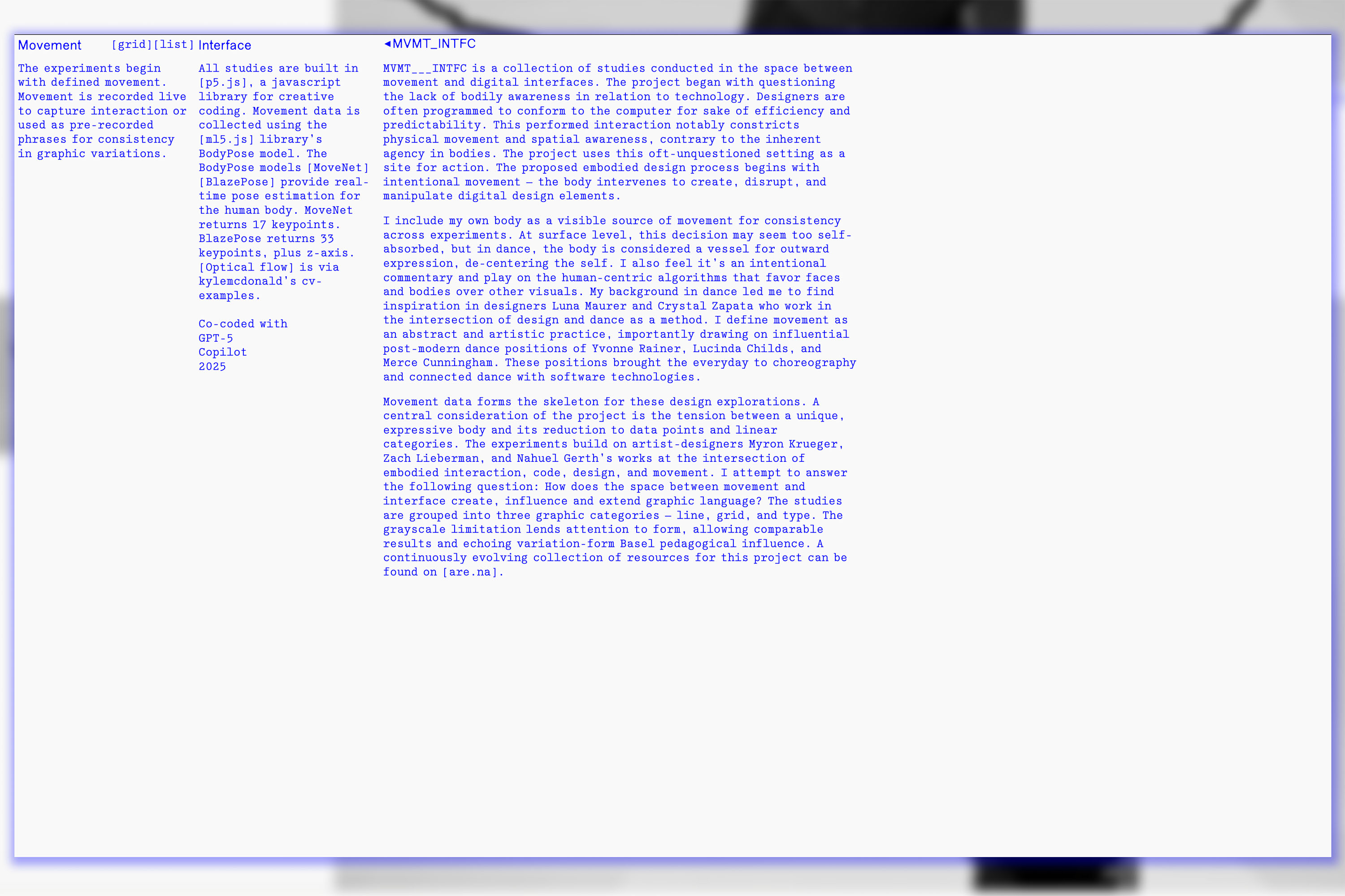
MVMT___INTFC is a collection of studies conducted in the space between movement and digital interfaces. The
project began with questioning the lack of bodily awareness in relation to technology. Designers are often
programmed to conform to the computer for sake of efficiency and predictability. The proposed embodied design
process begins with intentional movement — the body intervenes to create, disrupt, and manipulate digital
design elements. I attempt to answer the following question: How does the space between movement and interface
create, influence and extend graphic language? The studies are grouped into three graphic categories — line,
grid, and type. The grayscale limitation lends attention to form, allowing comparable results and echoing
variation-form Basel pedagogical influence.
MVMT___INTFC
Web / Code / Interactive
1/4
2026
A counter-archive of malware
read more
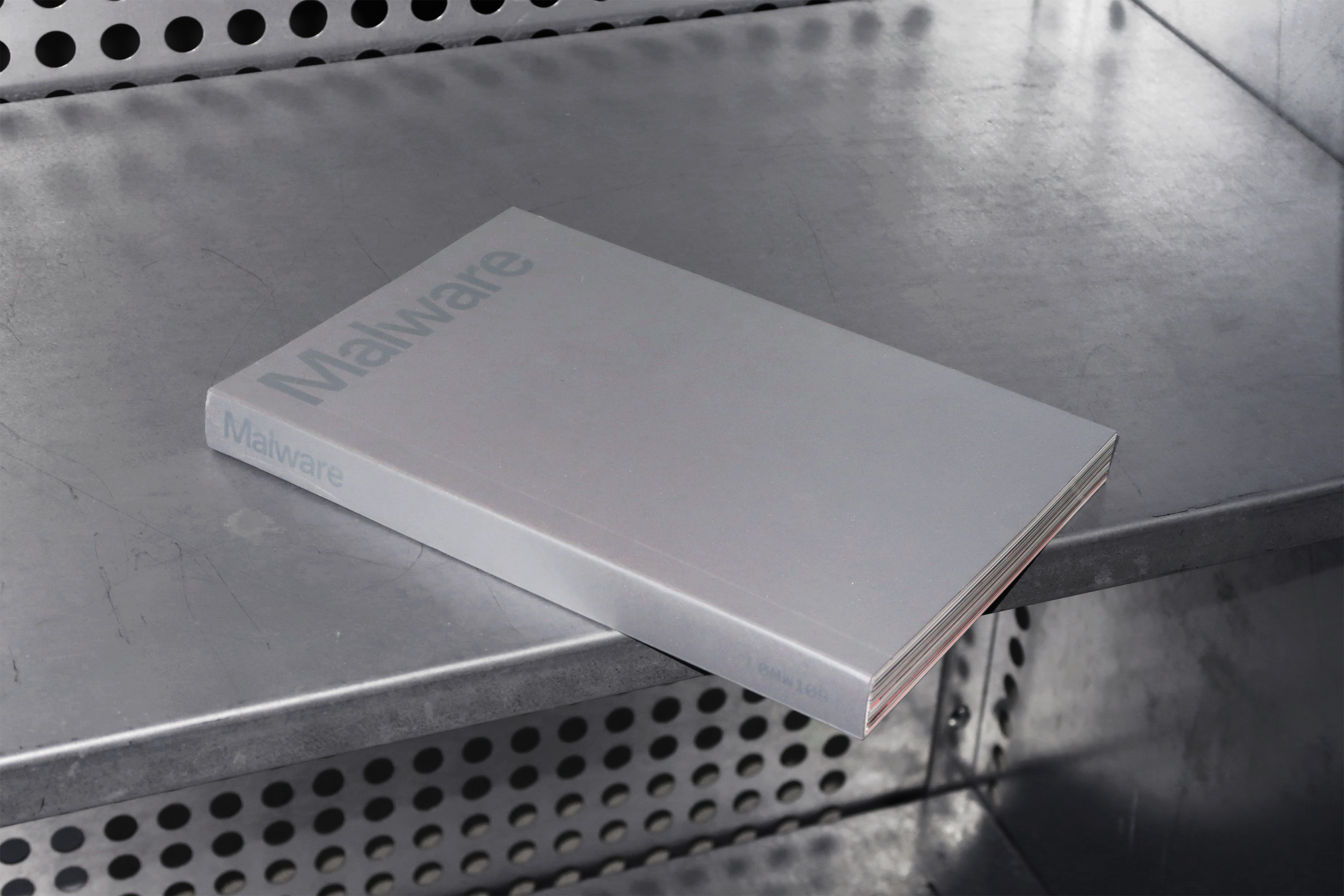
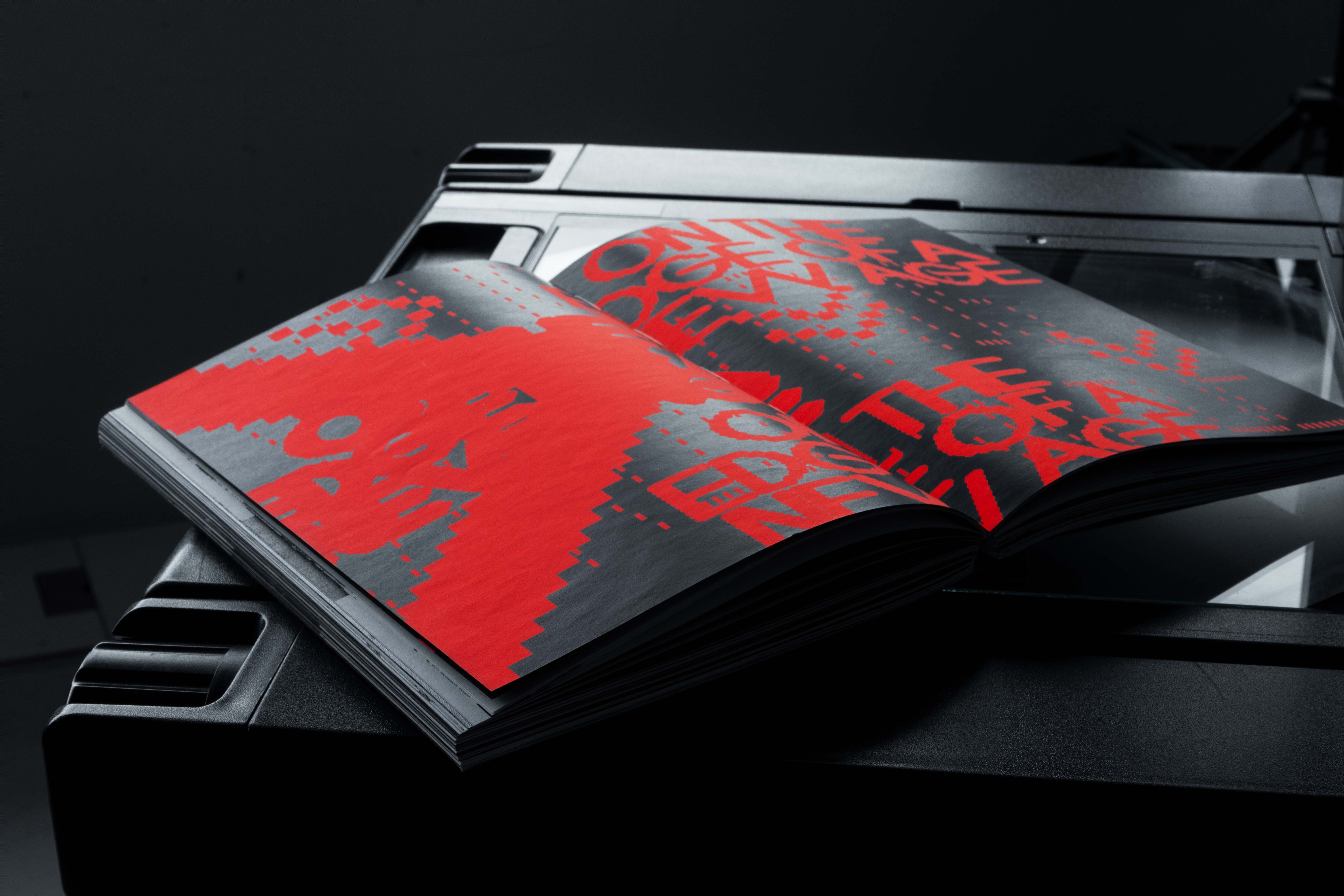
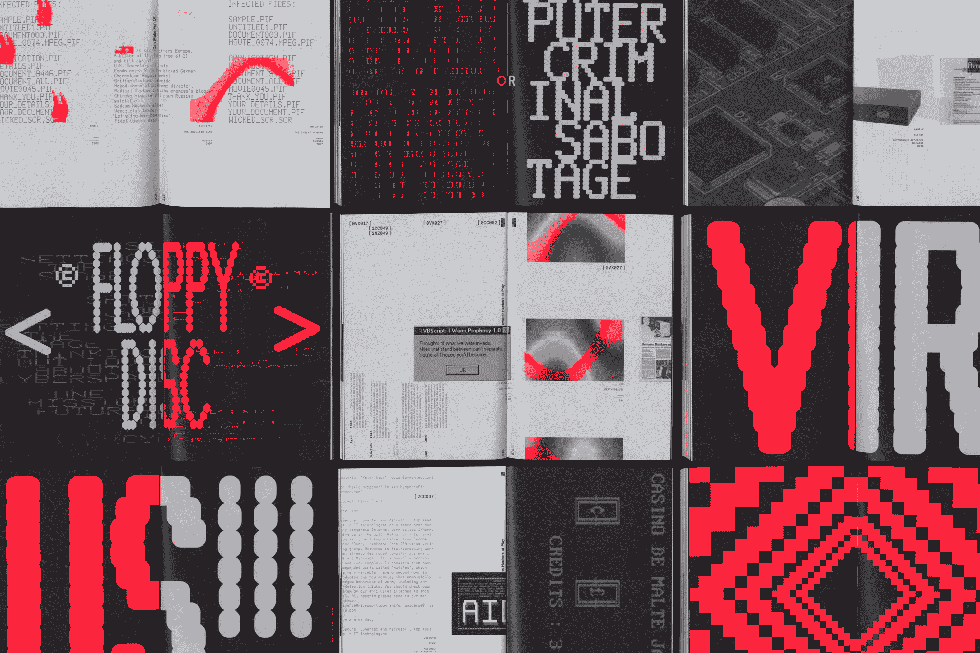
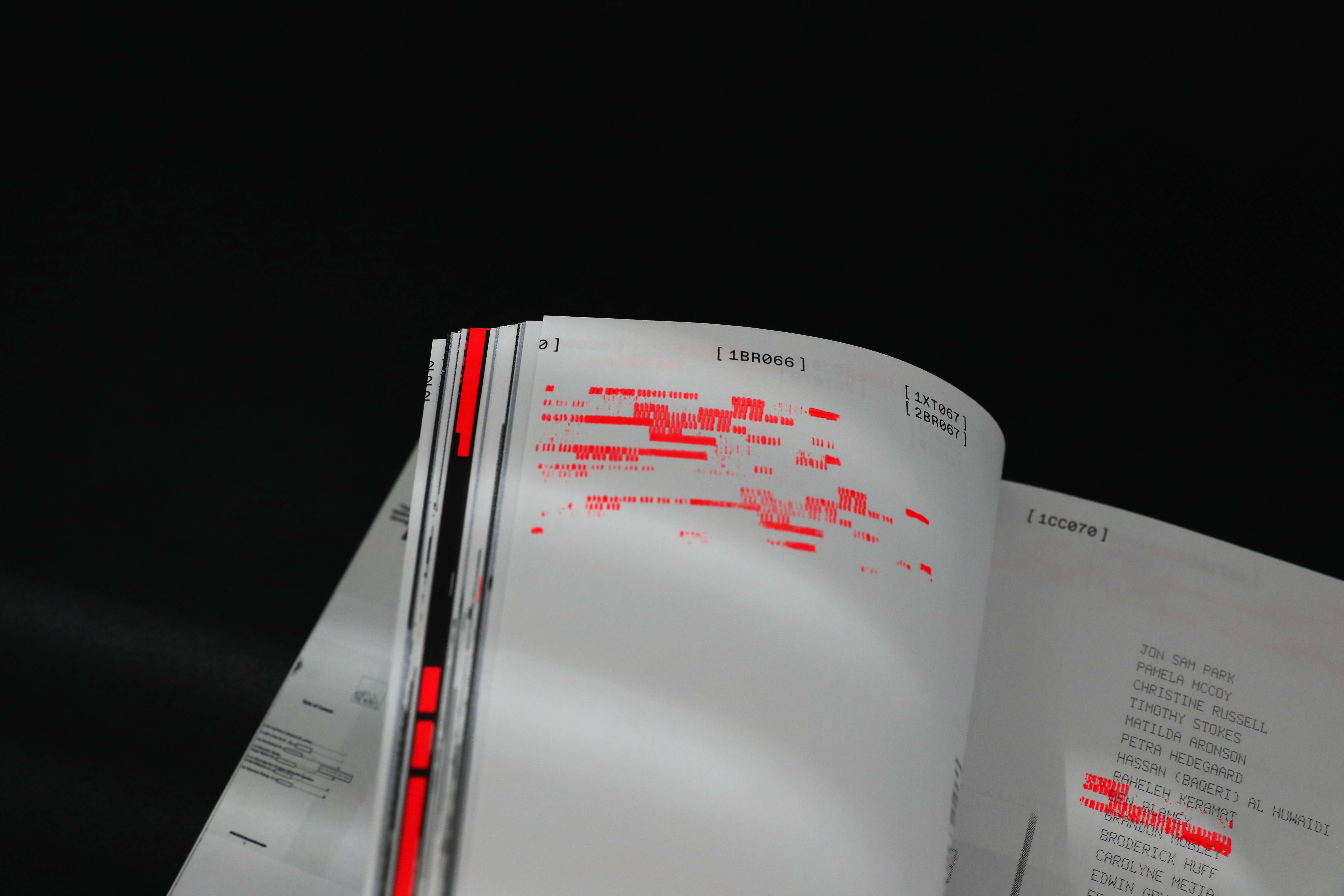
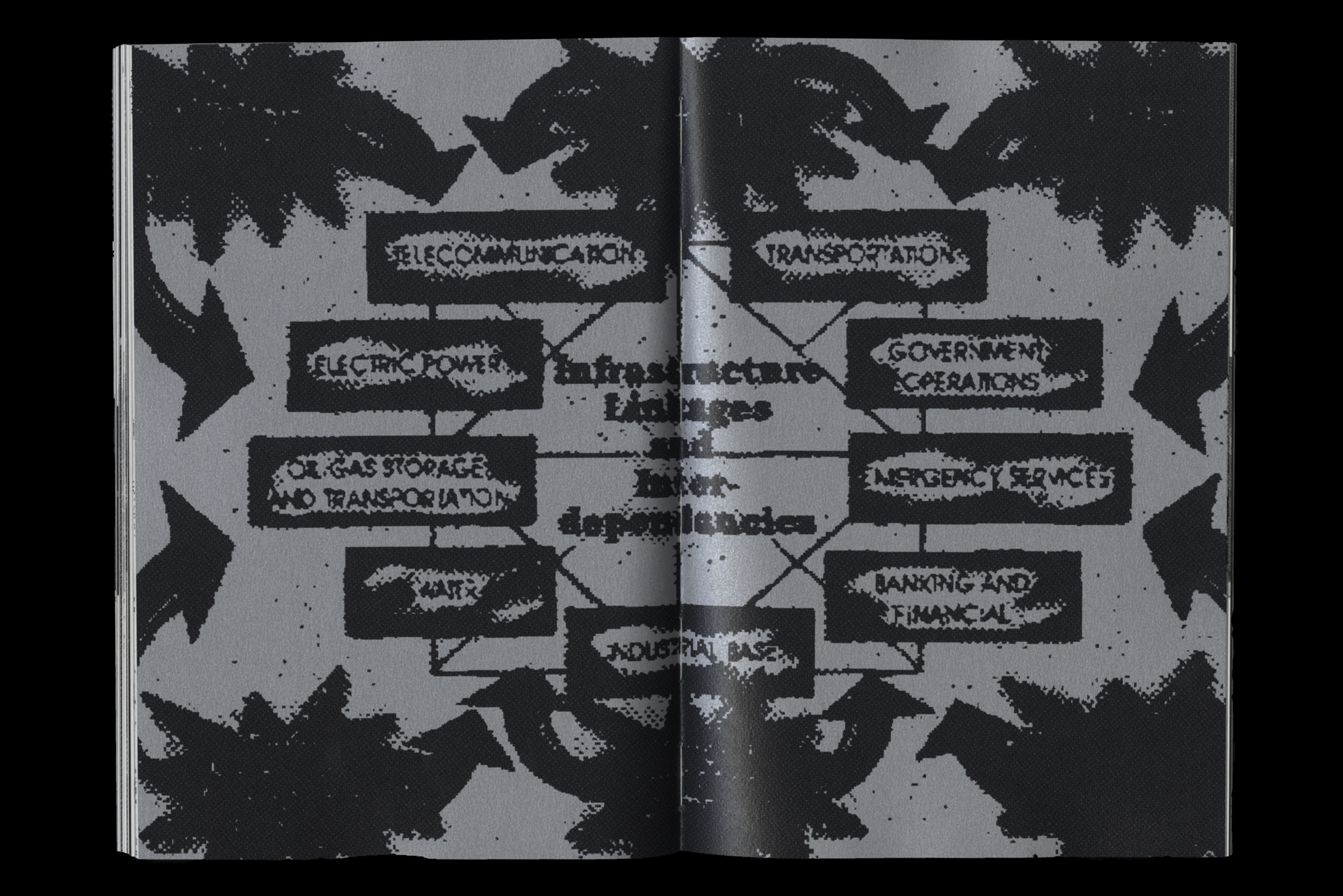
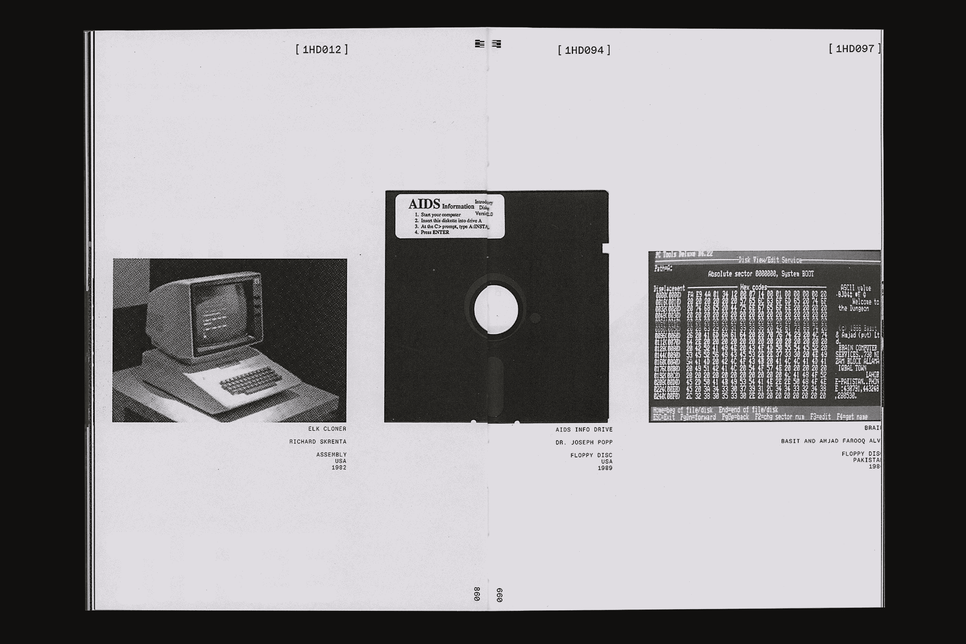
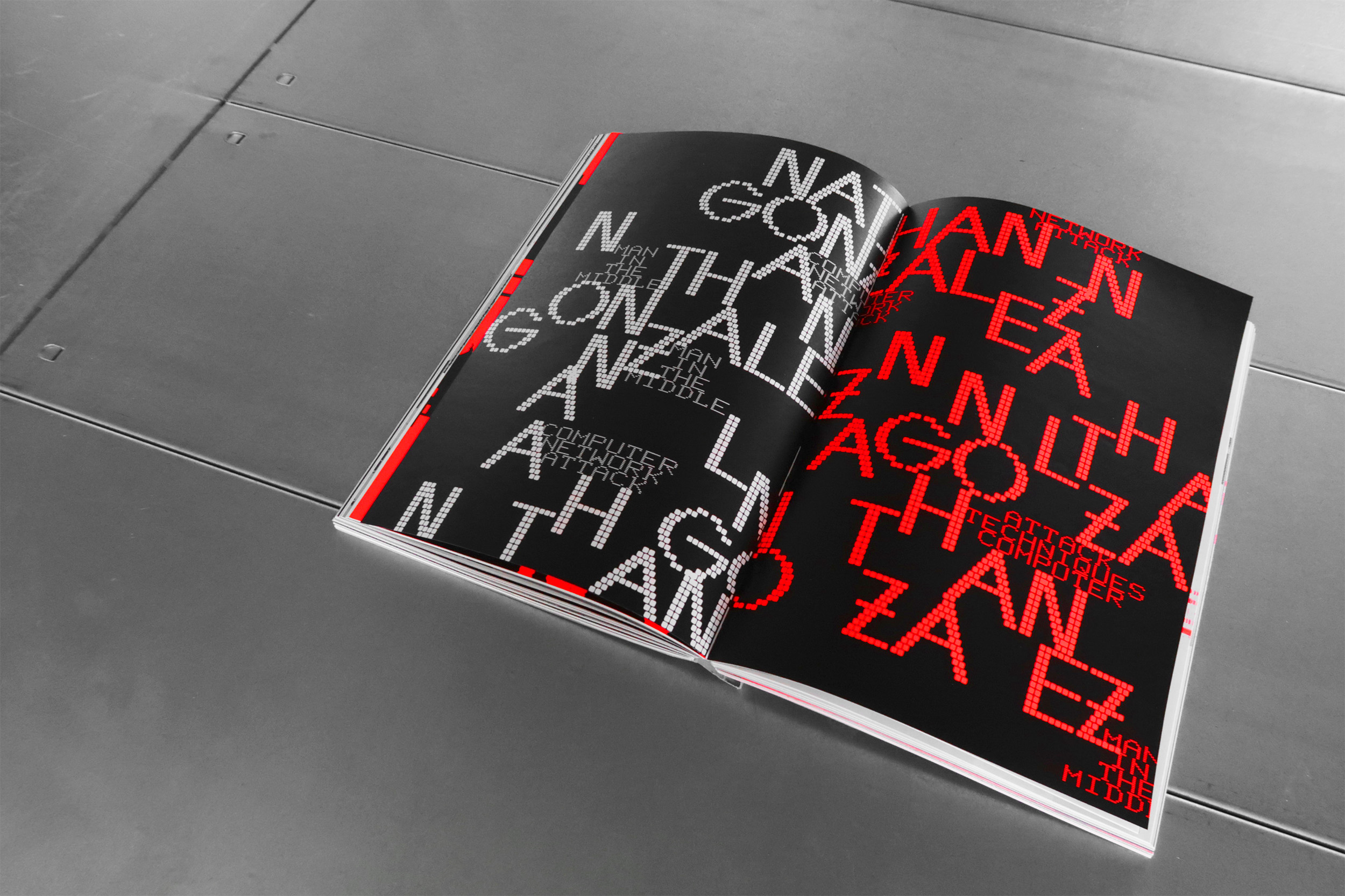
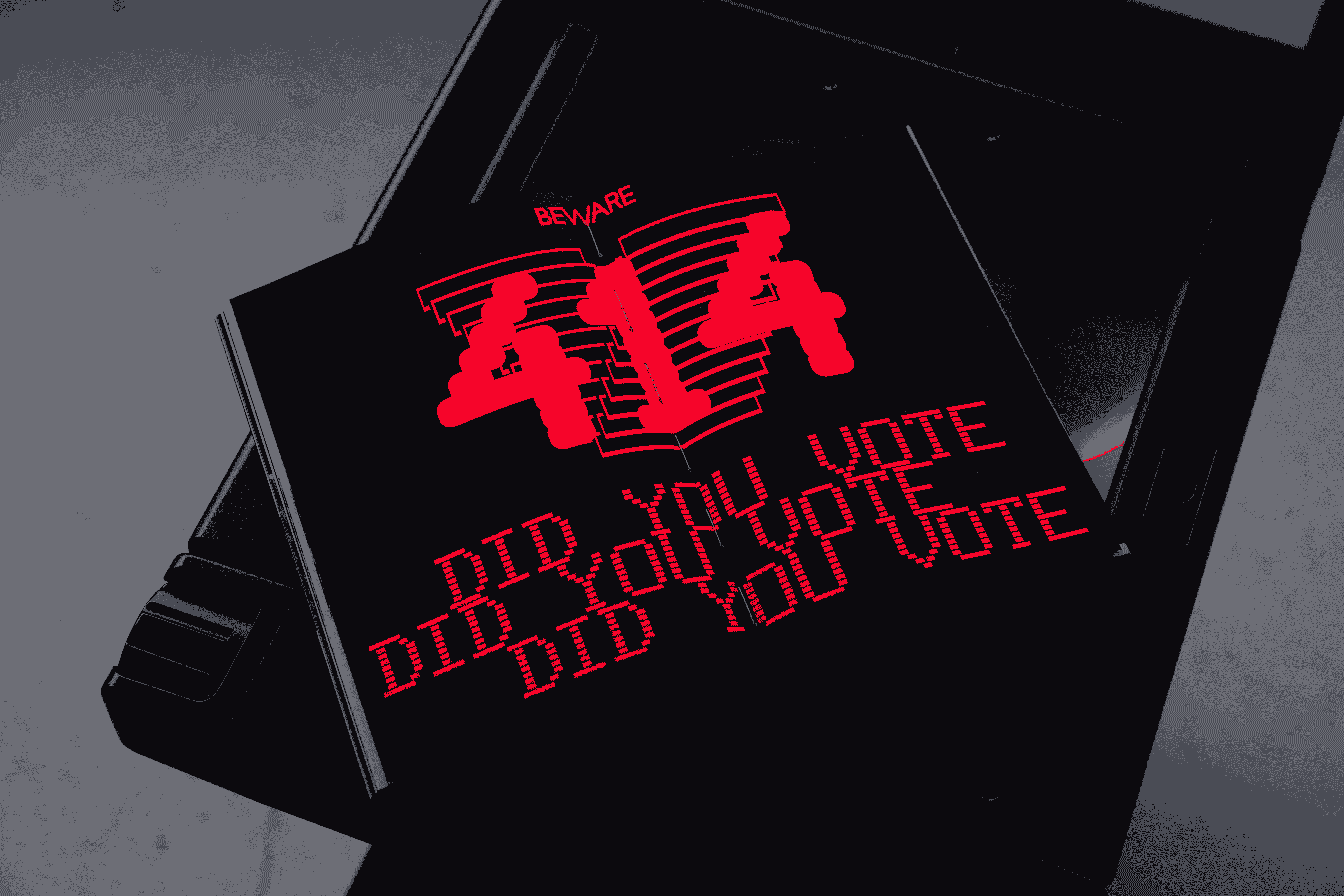
with Jules Hoogkamer An archive [0MW109] of malware: software designed
to damage, disrupt, or gain unauthorized access to a computer system. We addressed the question: how might we
preserve the history and evolution of an unstable
entity that evades collection? The book object’s angular, clean exterior draws visual associations with an
anonymous piece of hardware. Upon entering the archive, there are three distinct sections, divided by page
color. The white pages include all artifacts and textual references and develop a continous horizontal flow.
Interrupting this flow are silver pages that highlight artifact details. A custom categorization system in
cryptic codes and symbols allows for a non-linear reading of the archive. Per the nature of virii, neon orange
malware infects the book and proliferates. These chapter interventions juxtapose contradicting messages and
visuals from the artifacts, establishing conversation and an additional understanding of the archive. The
archive is damaged further by neon orange stamps that duplicate and spread until the end. These hand-stamped
pages emphasize important content while embodying the destructive nature of malware. The book functions as a
counter-archive by collecting an underside of technological advancement.
Malware [0MW109]
Editorial / Curation
1/11
2025
Combining tools as process
read more
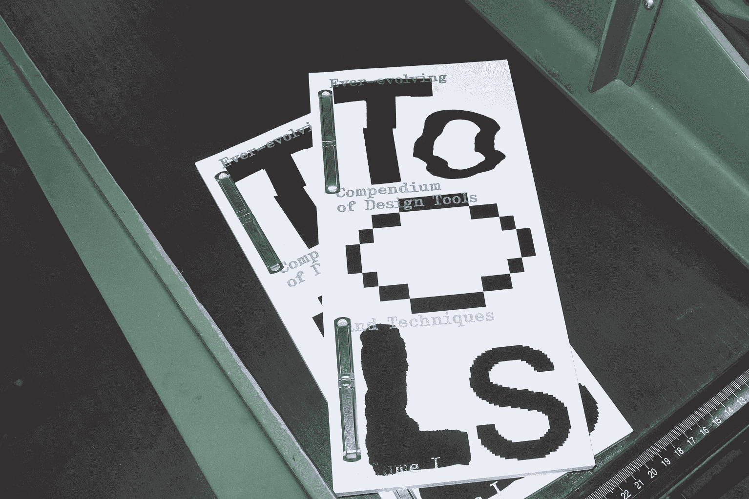
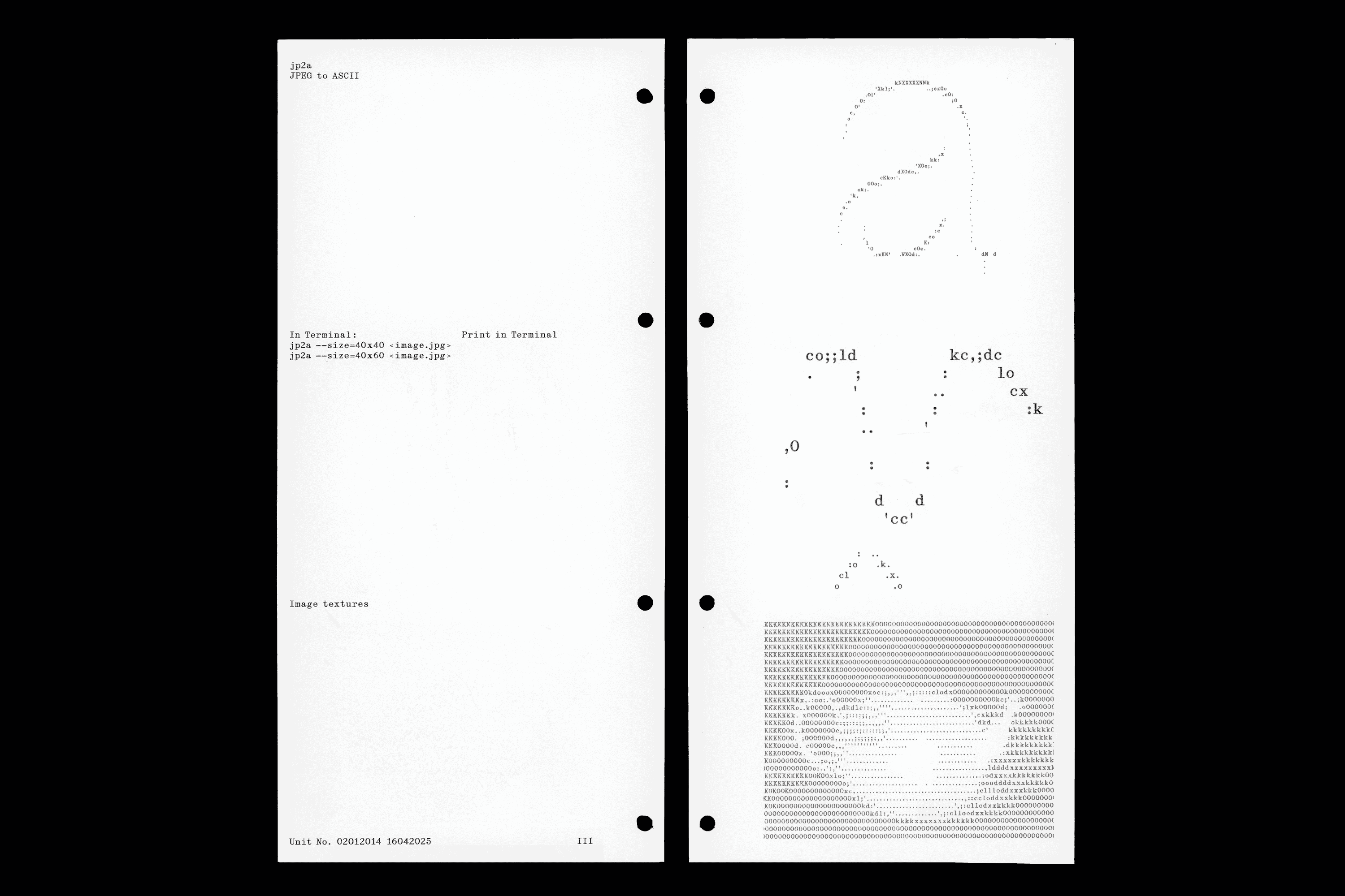
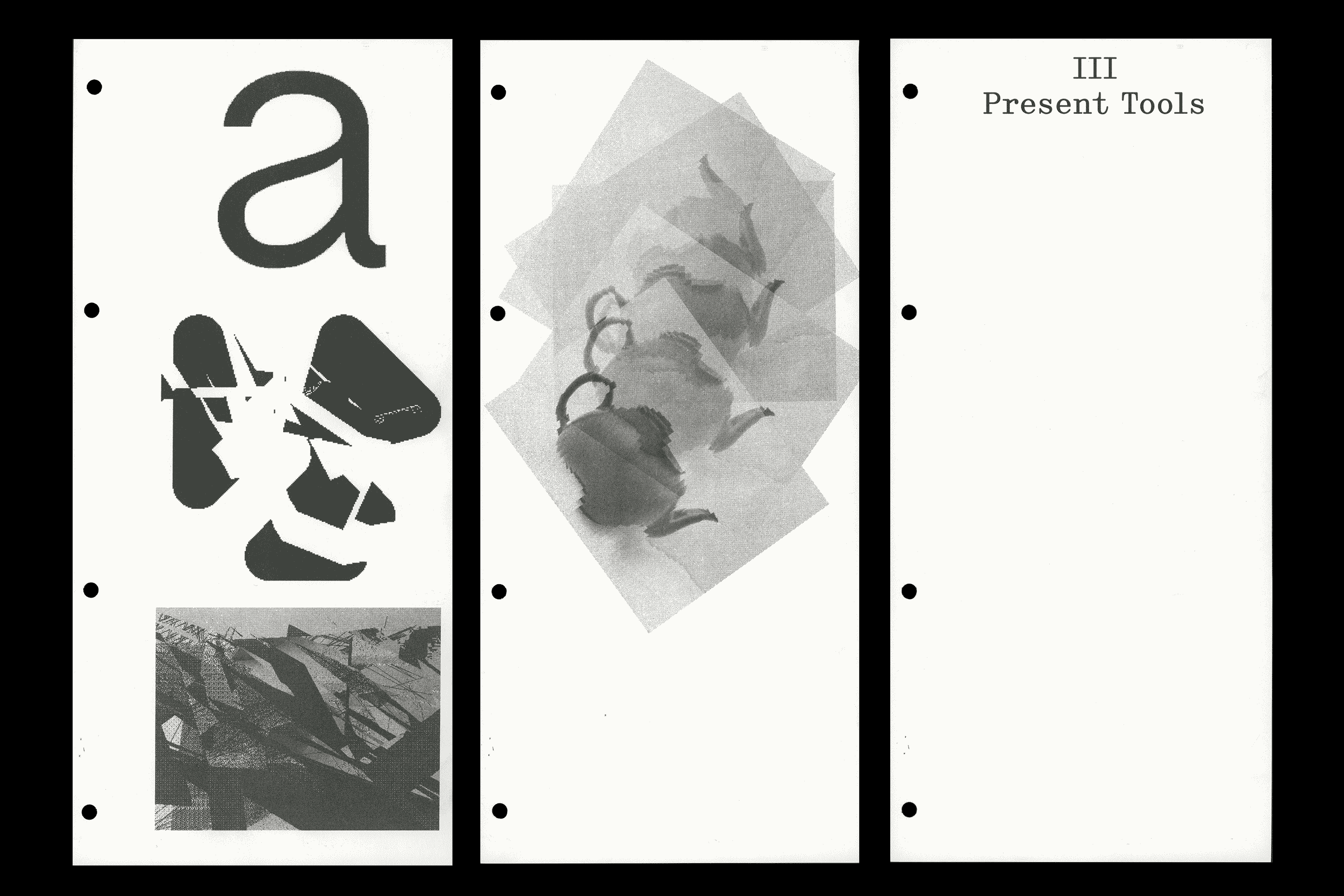
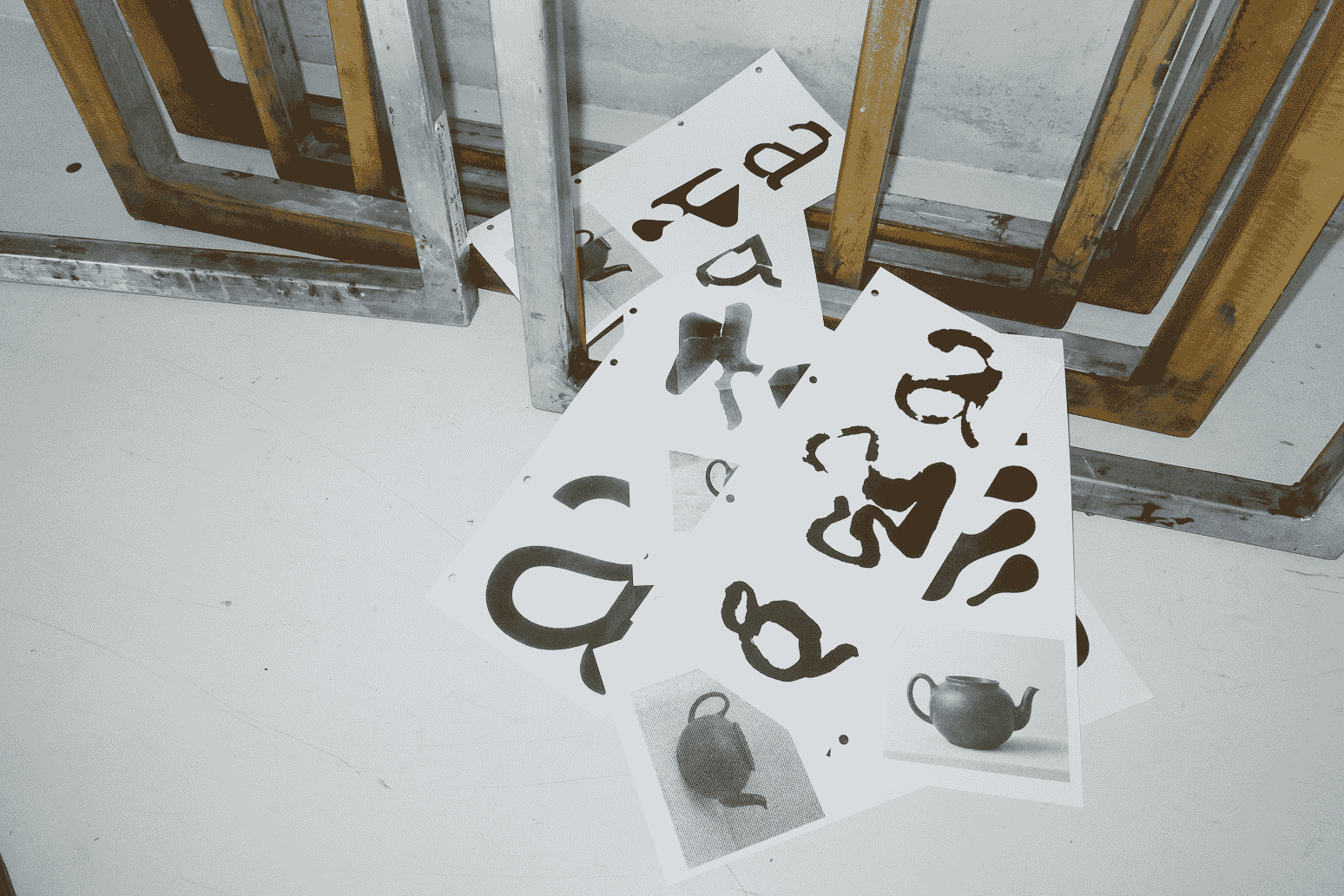
Compendium of Design Tools ↗Tools on Tour stems from an interest in bridging past and present methods in graphic design. The riso-printed catalogue is a visual compendium of design tools. The tool collection process included crowd-sourcing, interviewing faculty, and parsing through design history books and open source tool lists. Each page begins with the same input passed through a different tool to visualize and compare the tools' aesthetics. The catalogue is typeset in Director, a revival of a historical typeface. Metal binding connects past tools, such as lead type with present tools, such as metal-heavy hardware. The second aspect of this project is creating an experimental framework that combines past and present tools. The chosen techniques are the p5.js library and screenprinting. Myriad analogies exist between programming logic and technical aspects of screenprinting. Through combining similar functions of the techniques, each tool's limitations become areas for intervention. Combining tools in a design process has the potential to extend tools' functions and lead to aesthetic heterogeneity. The method may be applied to any future project. Tools on Tour was realized based on the task: design your own task.
Tools on Tour
Code / Print / Editorial
1/8
2025
Material-driven posters
read more
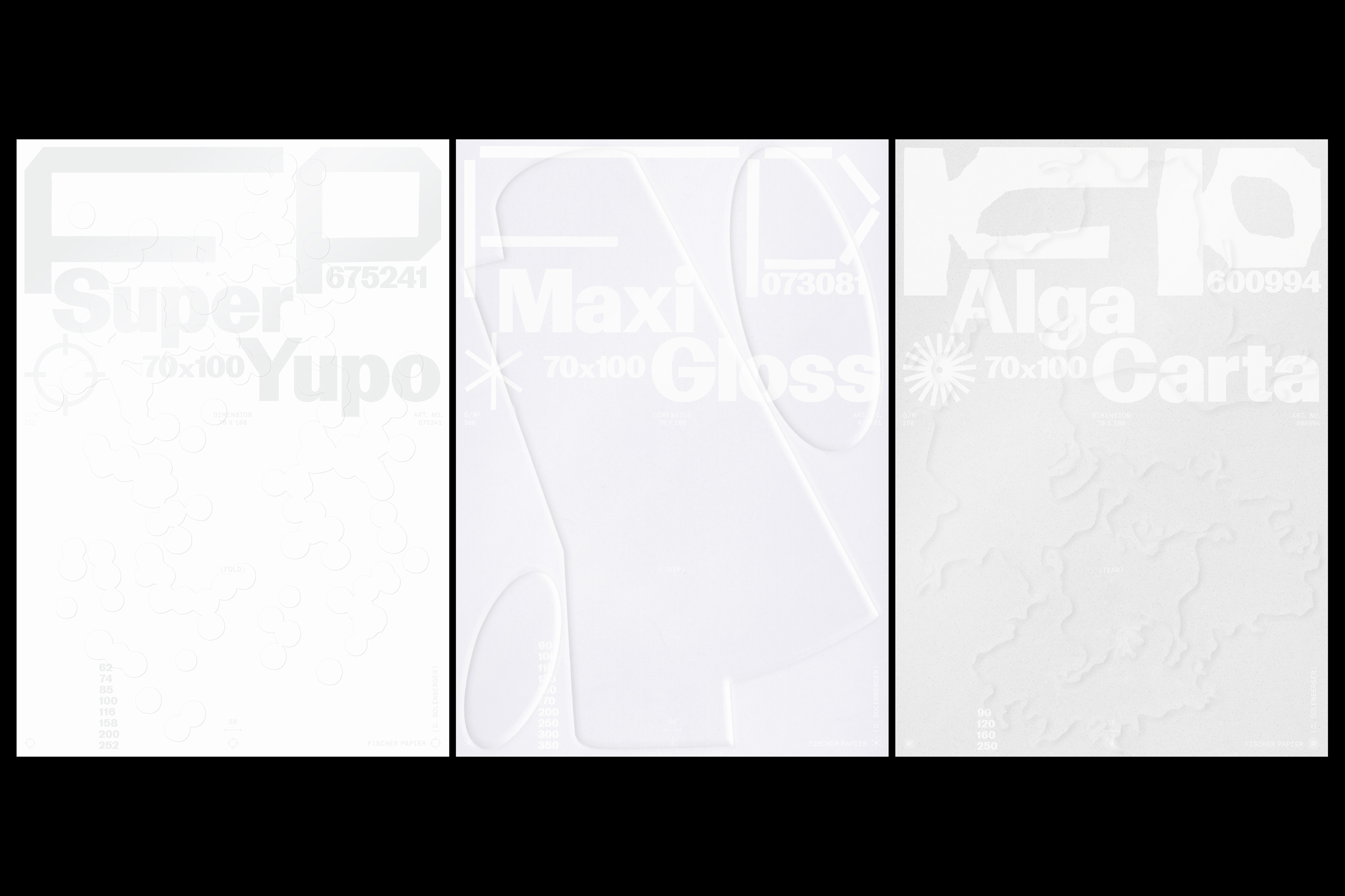
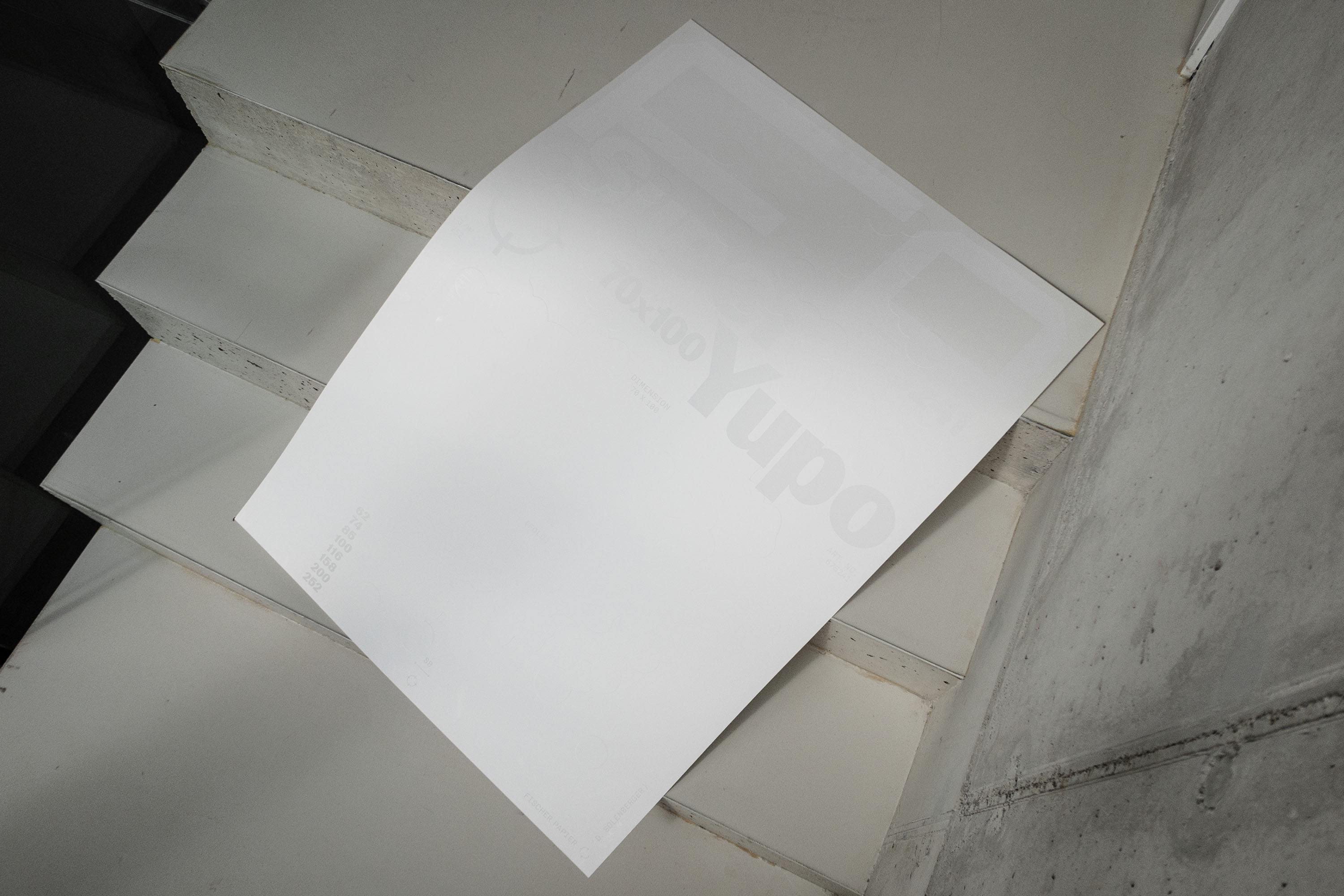
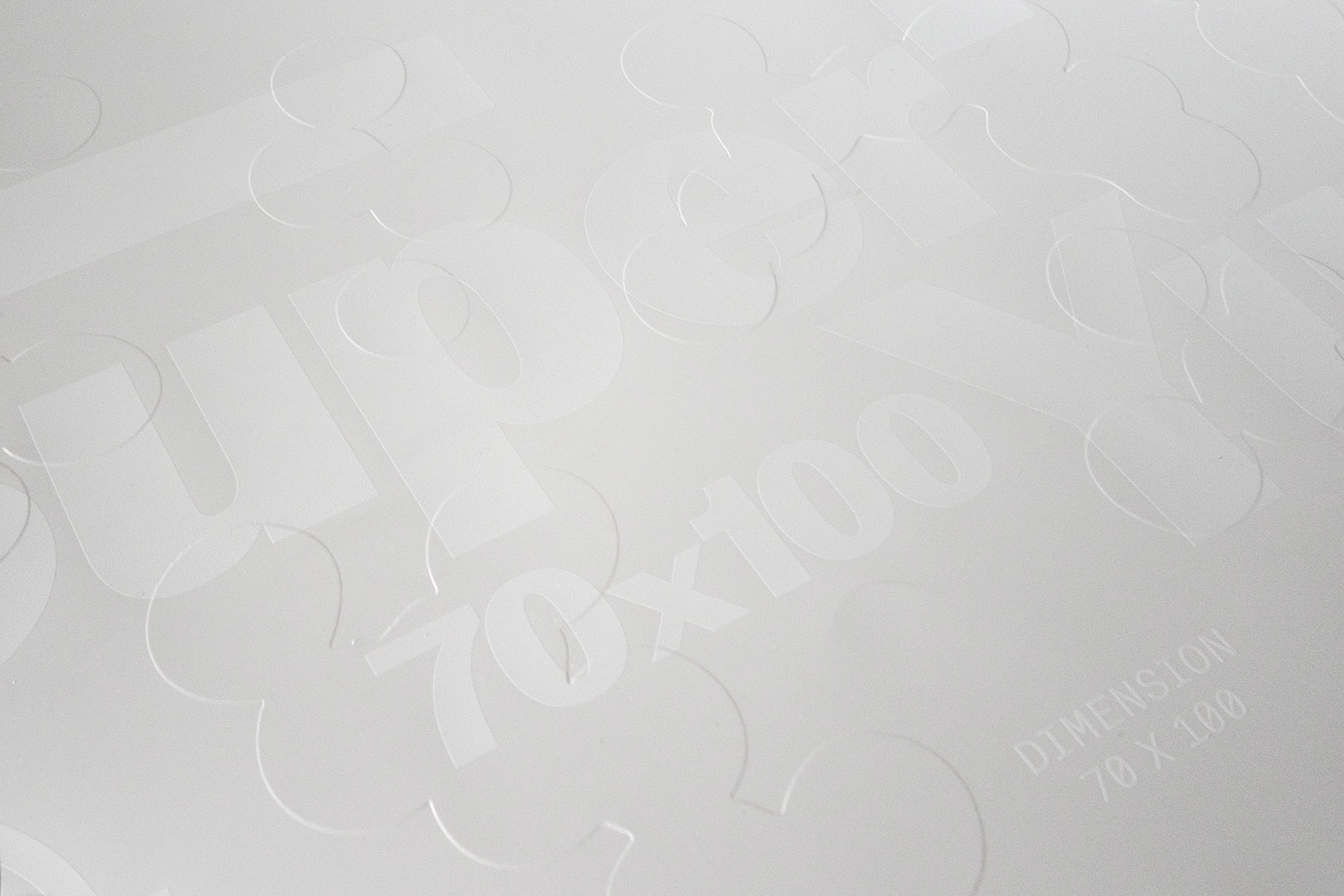
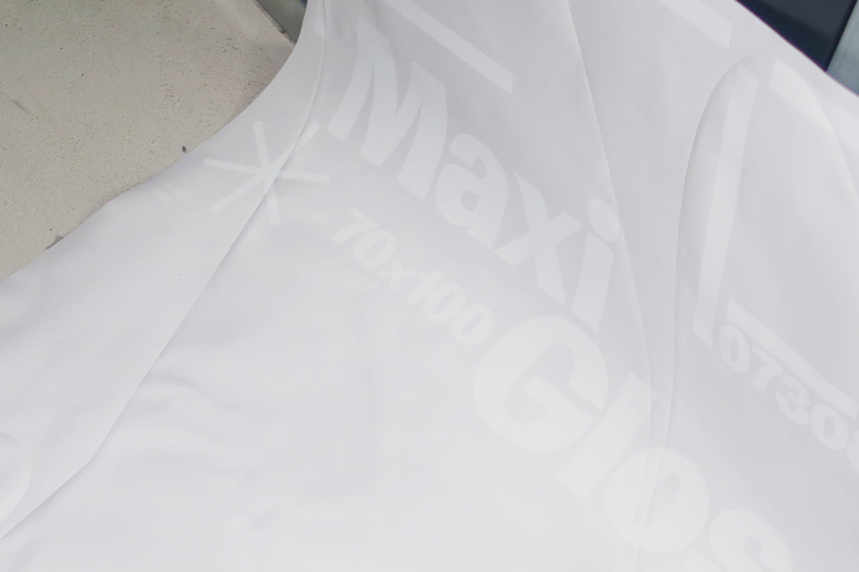
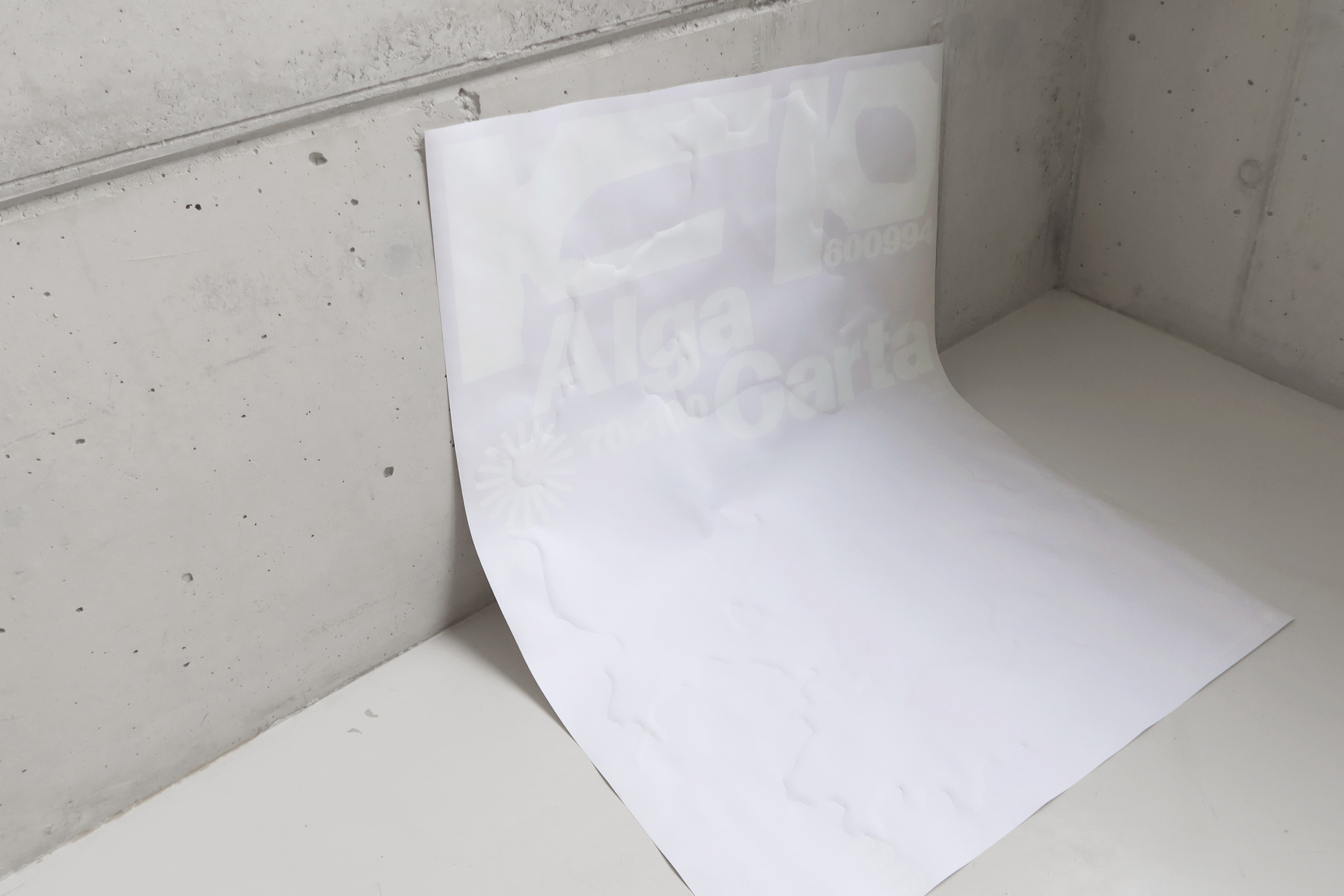
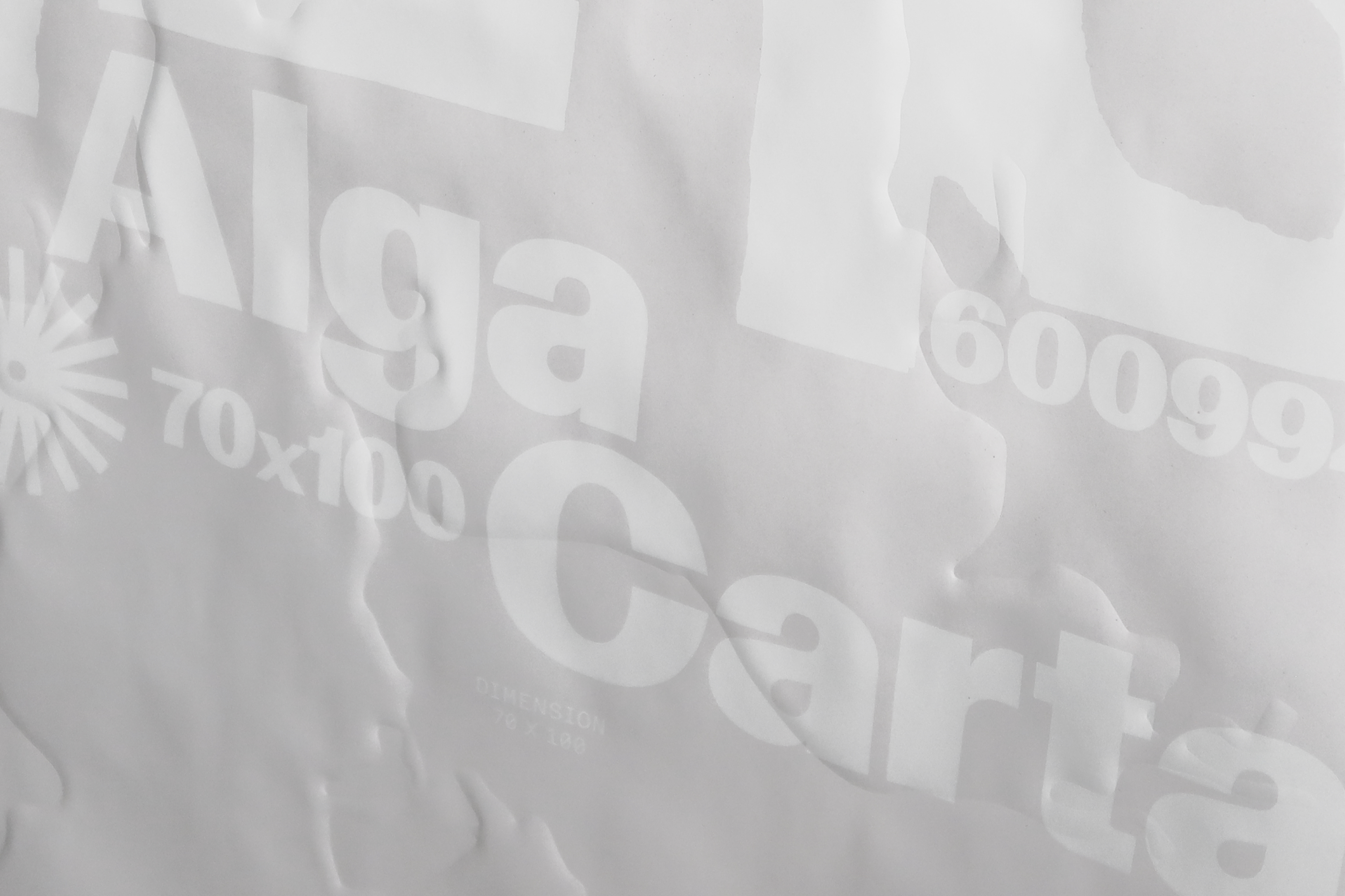
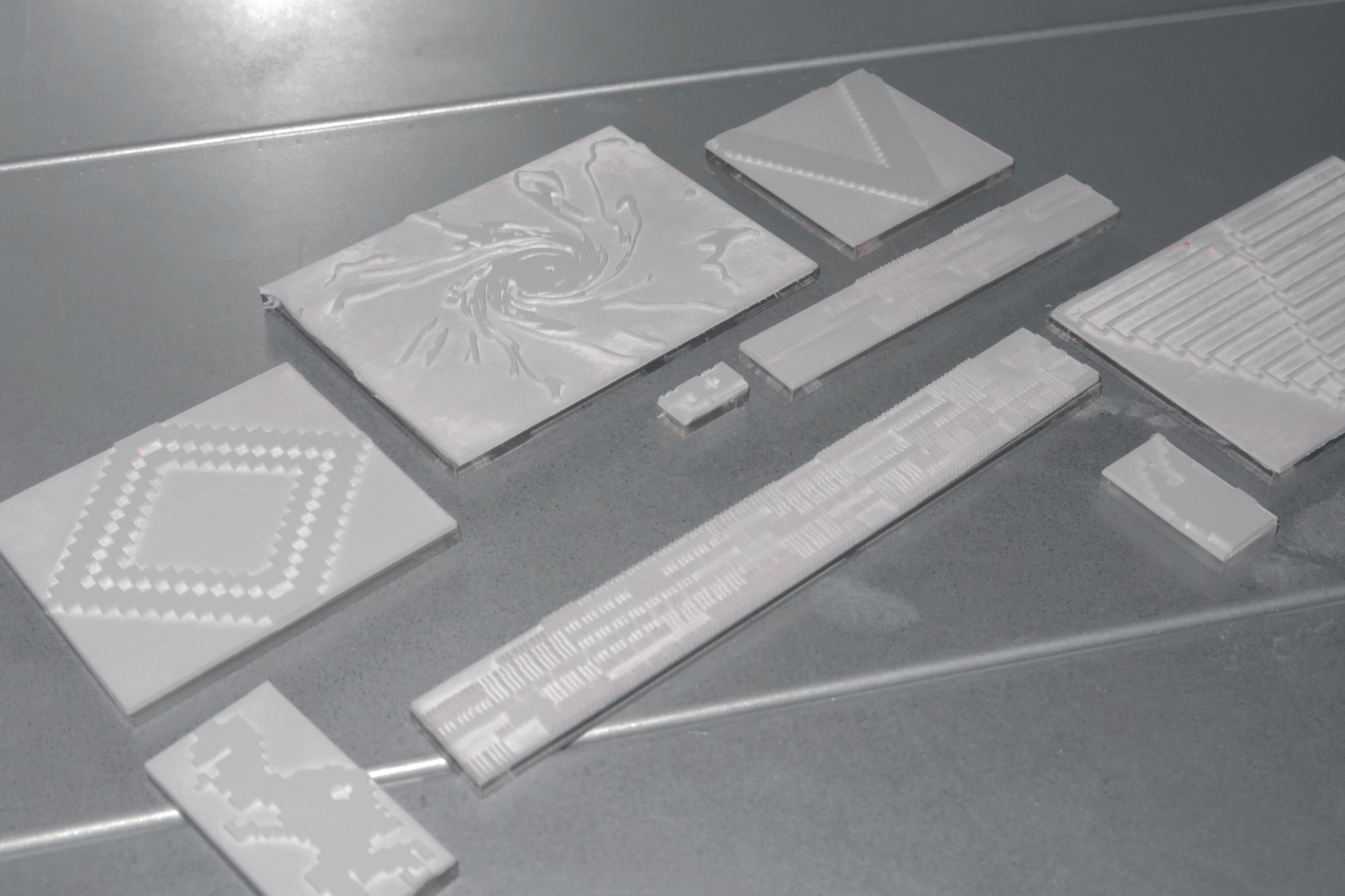
A poster campaign concept and series for Fischer Papier. Each poster functions as a large-format paper sample printed on original paper. Custom white ink shades are screenprinted on each poster, making the text invisible at certain angles to emphasize the paper itself. The embossed, 3D, tactile poster surfaces are created with large-format blind embossing via a vacuum press. These embossed shapes, originally formed with paper and photographed, visually describe the individual materiality of each paper: Alga Carta, seaweed, Maxi Gloss, gloss coated, SuperYupo, plastic. The campaign includes a variable logo concept for Fischer Papier made only with physical manipulations of paper: fold, tear, cut.
Fischer Papier
Poster / Identity
1/7
2025
Visualizing metadata
read more
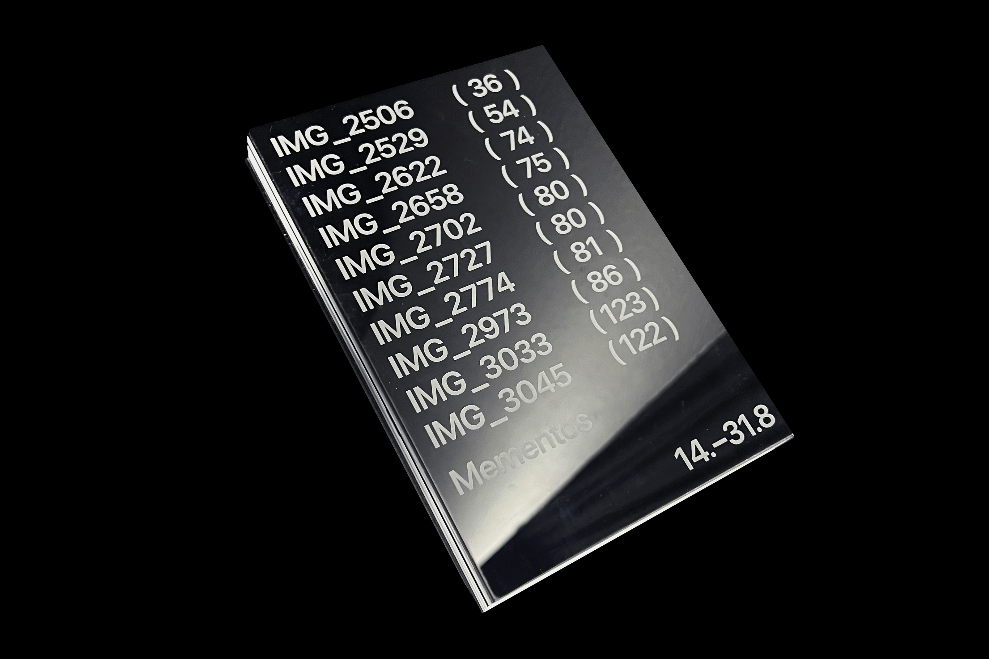
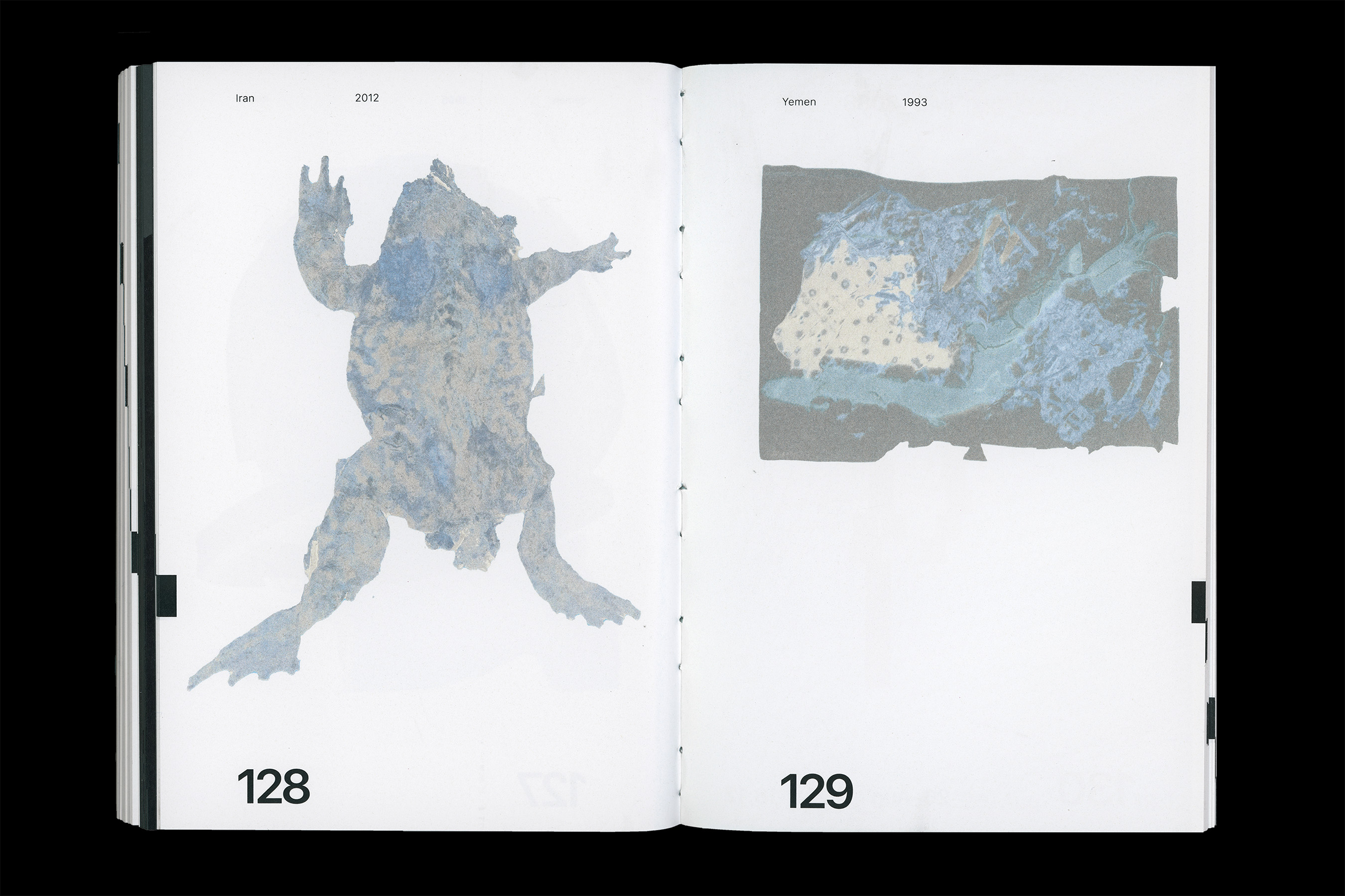
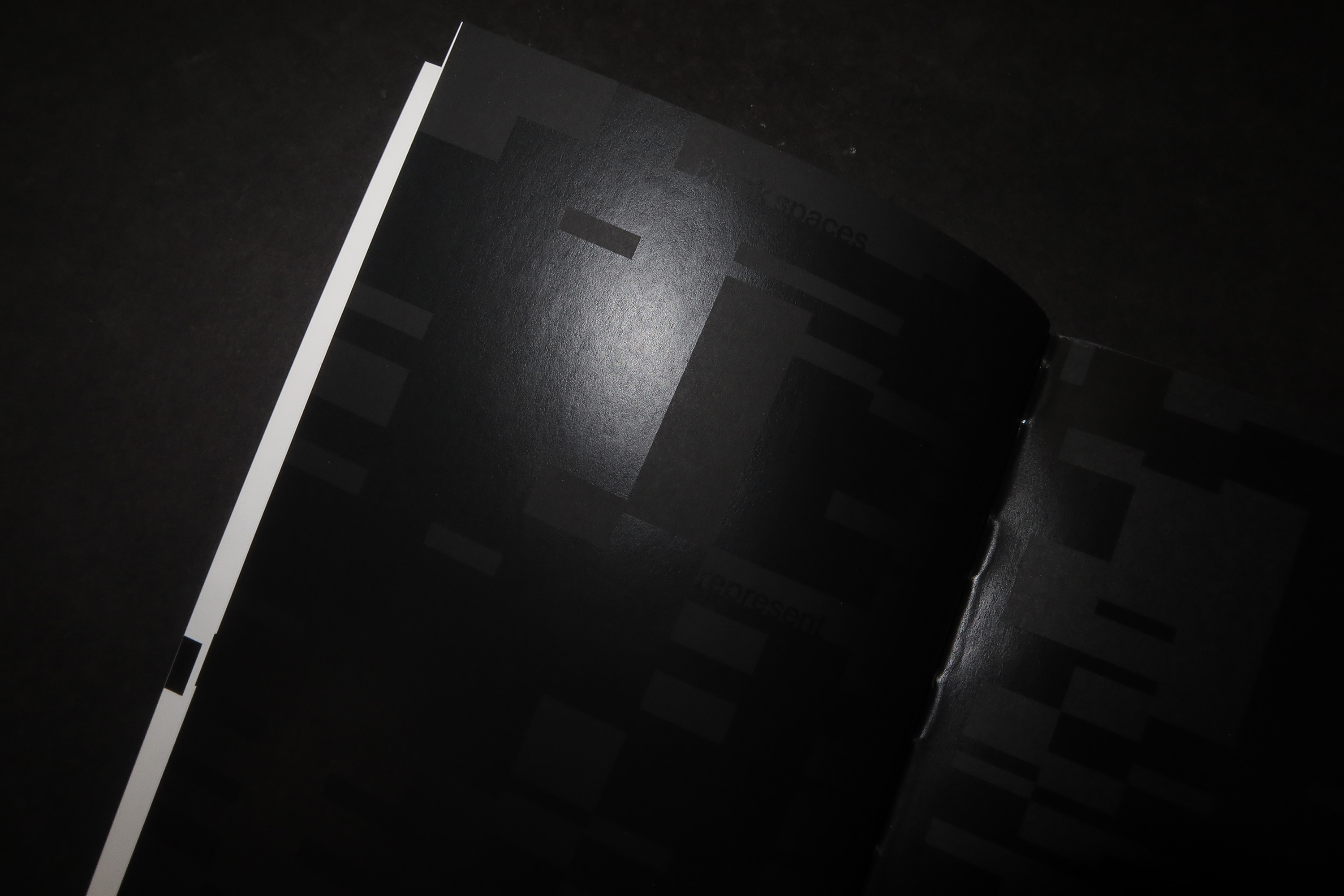
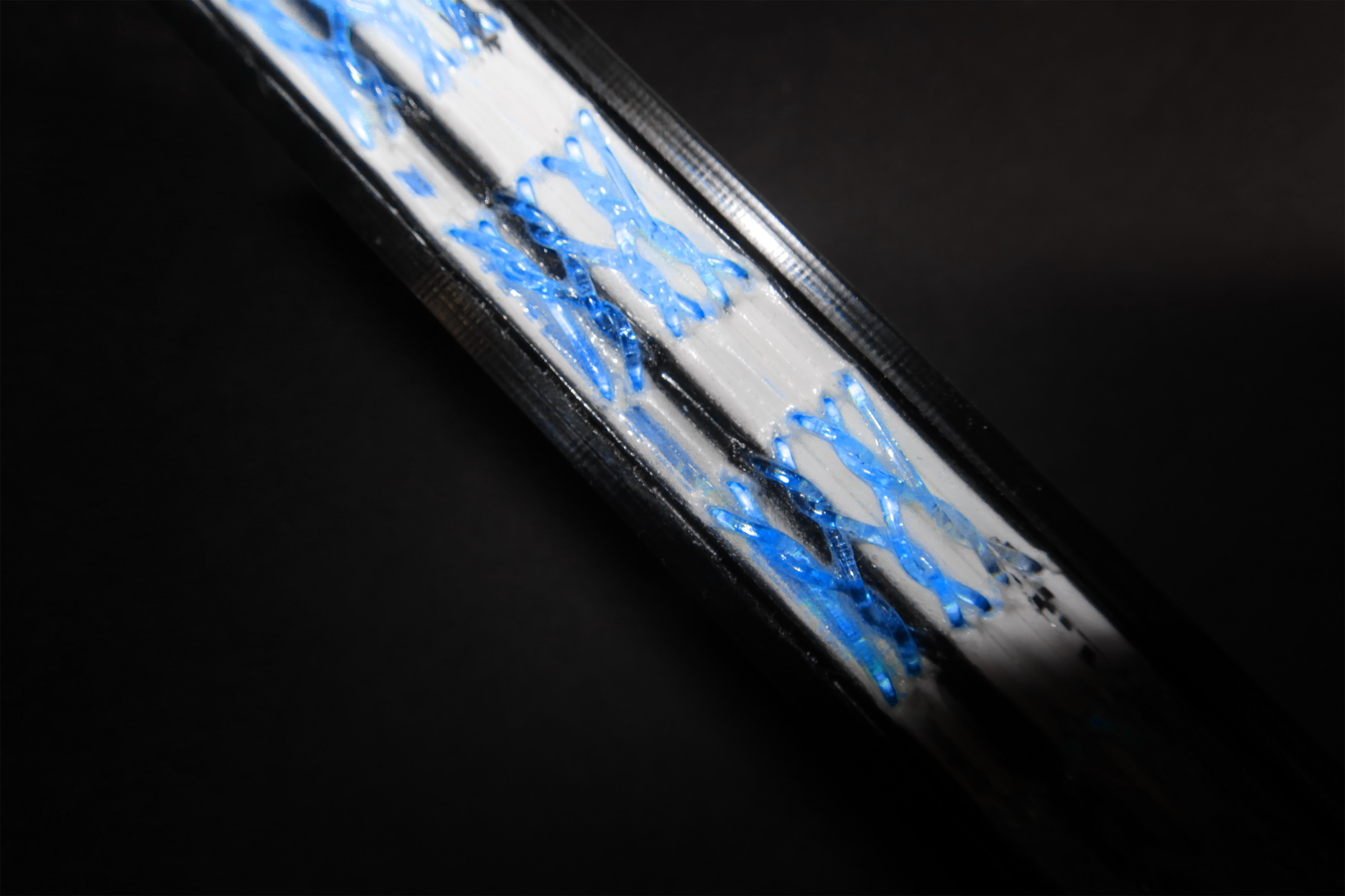
Design short list
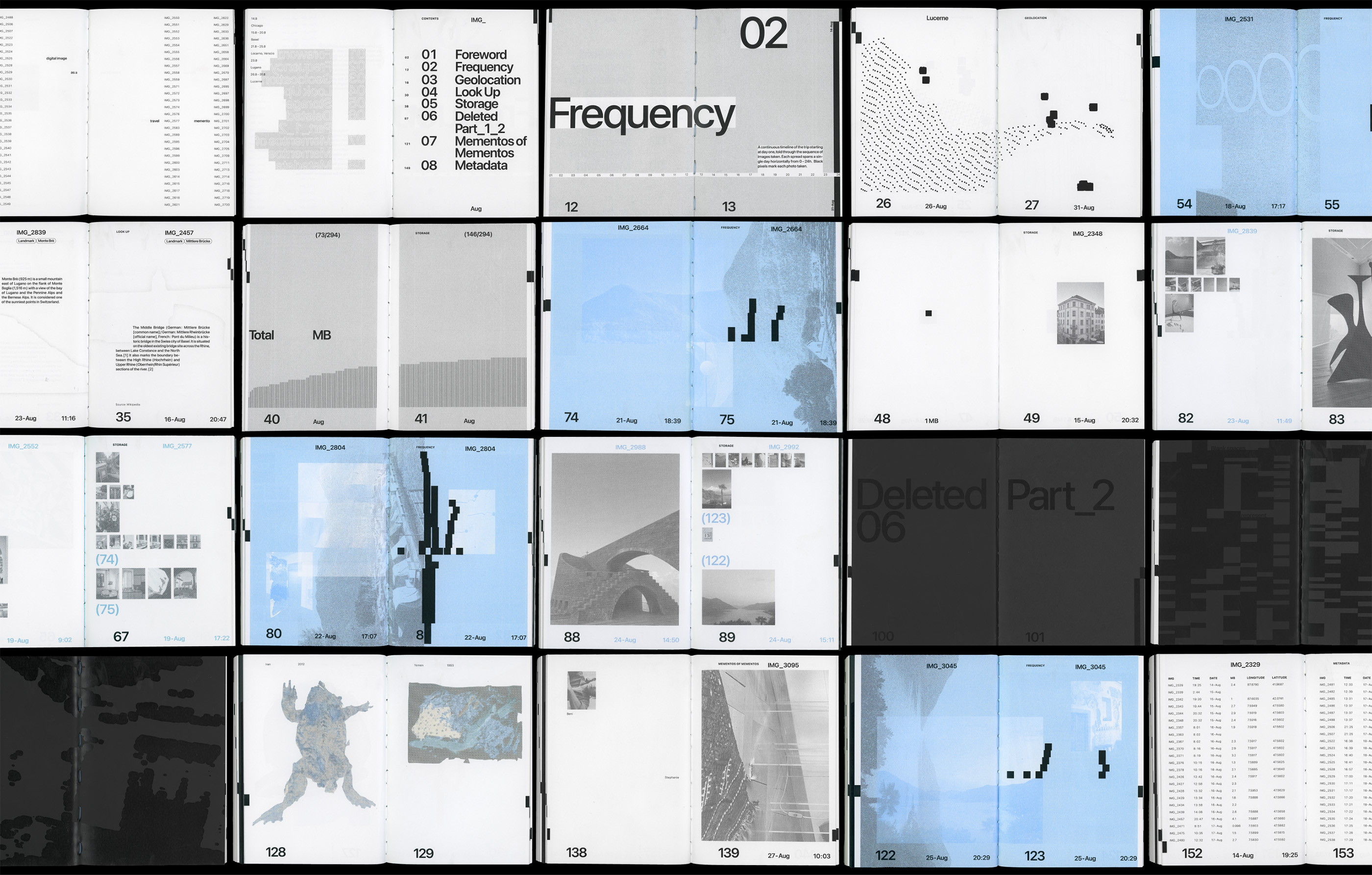
Communication Arts, 2025 The digital image as a
travel memento. 18 days, six cities, and 294 photos. Images take up space on a digital shelf but are
invisible; any neglection is immune to dust. Through the lens of digital images and corresponding data,
Mementos has three goals: (1) data dissection, (2) a personal photo album, (3) annotations on memory and the
creation of mementos. The book objectively and subjectively explores the question—Are these photos valuable
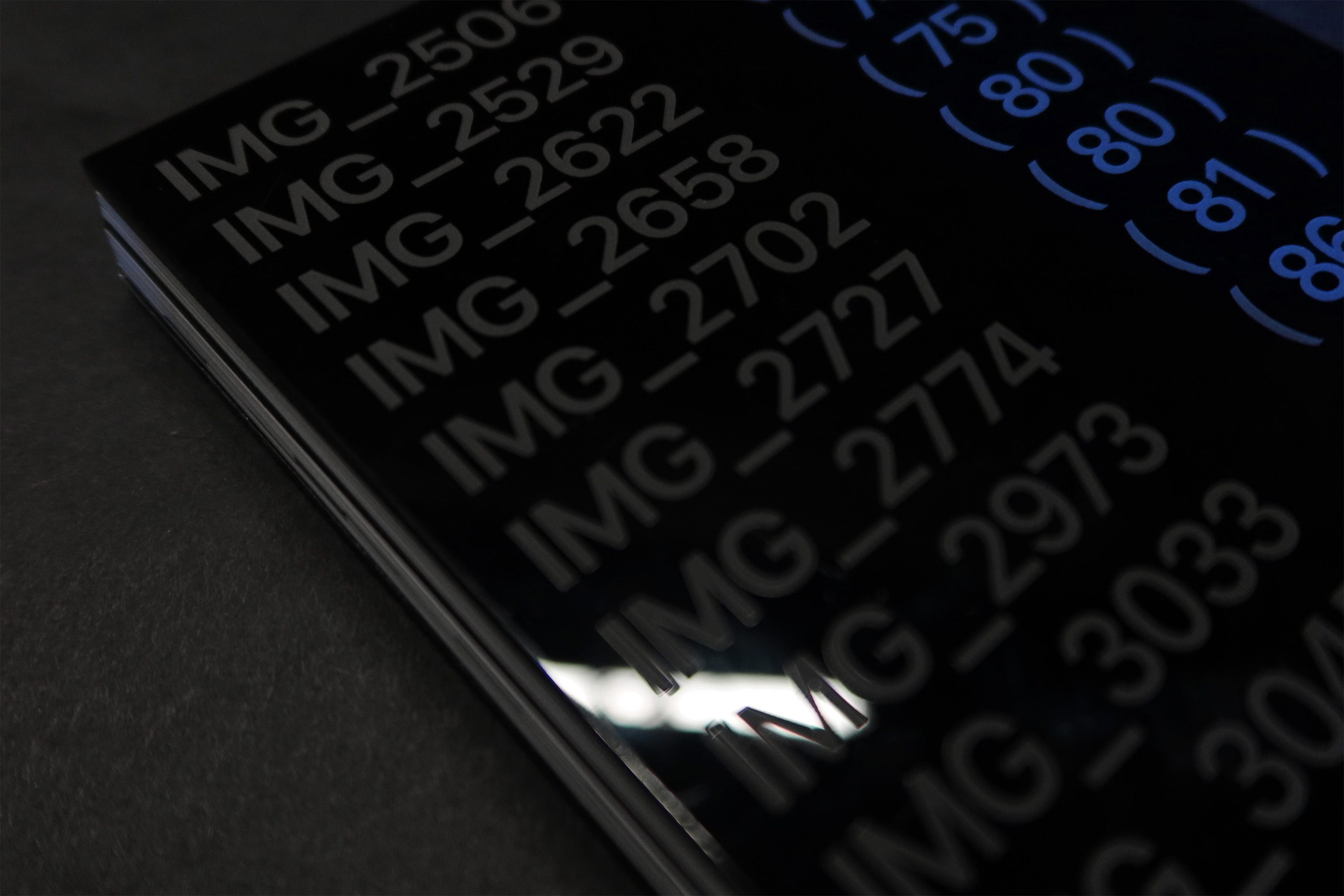
mementos of the trip? The book’s form is inspired by physical data storage centers—industrial server farms,
twisted cables and reflective phone screens. Apple’s system font emphasizes the digital interface. Images are
reduced to black pixels, highlighting inherent ephemerality and intangibility. A travel timeline spans the
book, extending to the outer edge and the front cover. Three images contain potent memories of autobiographical objects that become reference
points for what constitutes a valuable memento.
Mementos
Editorial / Information
1/9
2025
Code to print zine
read more
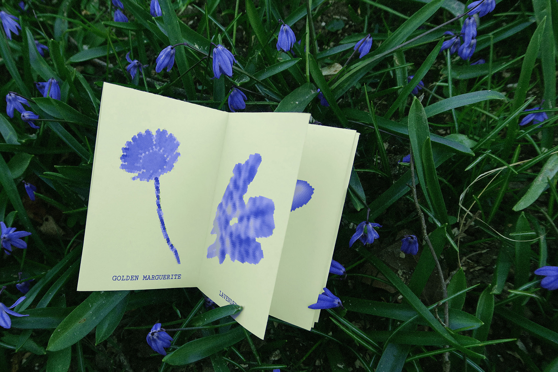
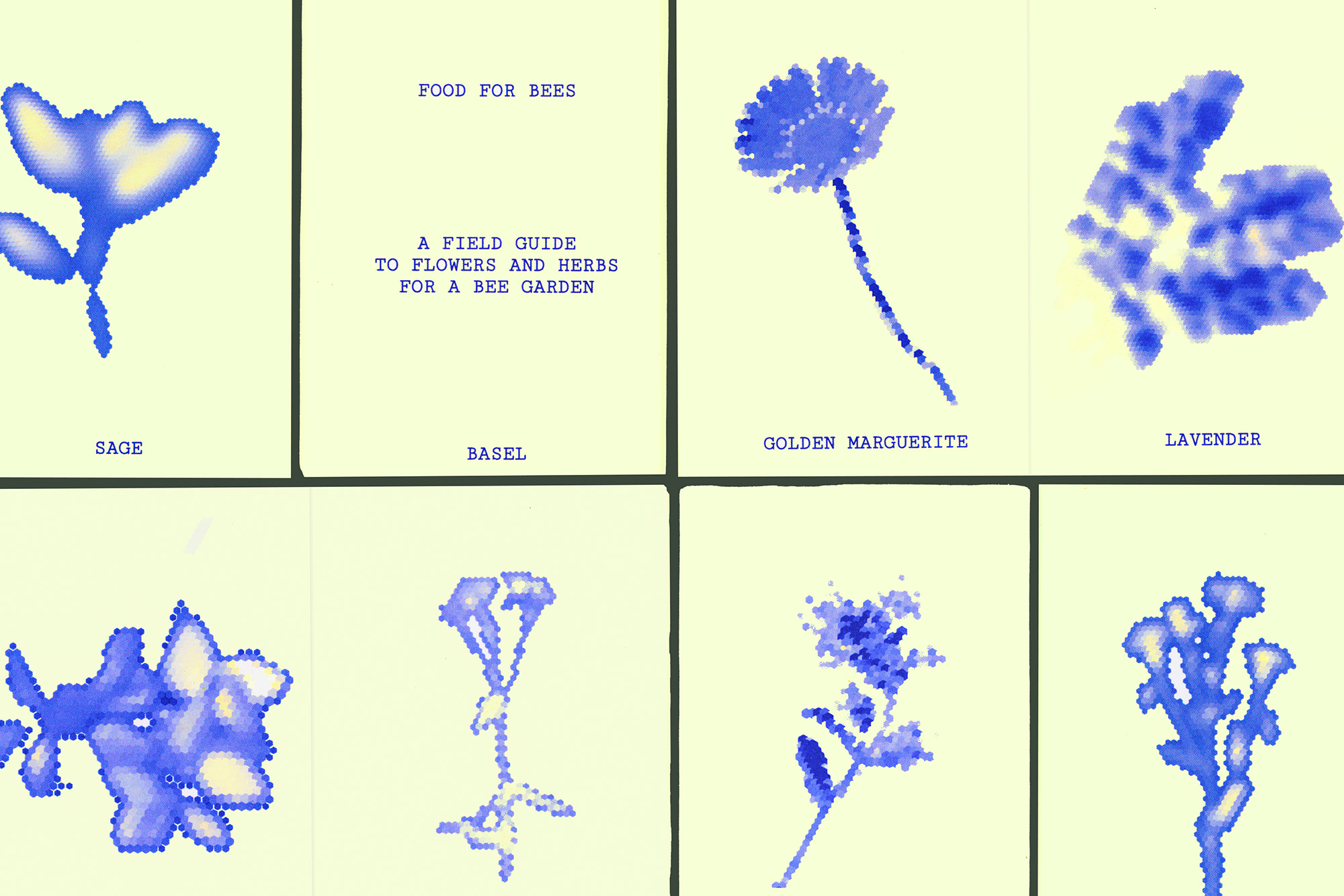
Biodiversity crises intertwine with ambient spaces. Food for Bees serves as a digital garden and resource for wild bee populations in northwest Switzerland. The platform embraces slowness, meditation, and discovery, inspired by Maggie Appleton’s writing on digital gardens. Contrary to the usual information overload, layers of context appear when discovered by the participant. Upon experiencing the meditative space, the ‘print to grow’ function results in an on-demand printable zine containing specific flowers and herbs that support local bee populations. This resource gathers findings from multiple scientific studies in the region. Onlookers view the flowers through bee vision: the crystallized texture and ultraviolet color gradients are characteristic of bees’ visual environment. This analog and digital space is in service of local bees, embracing a more-than-human audience and perspective.
Food for Bees
Web / Editorial / Code
1/6
2025
Contradiction as layout method
read more
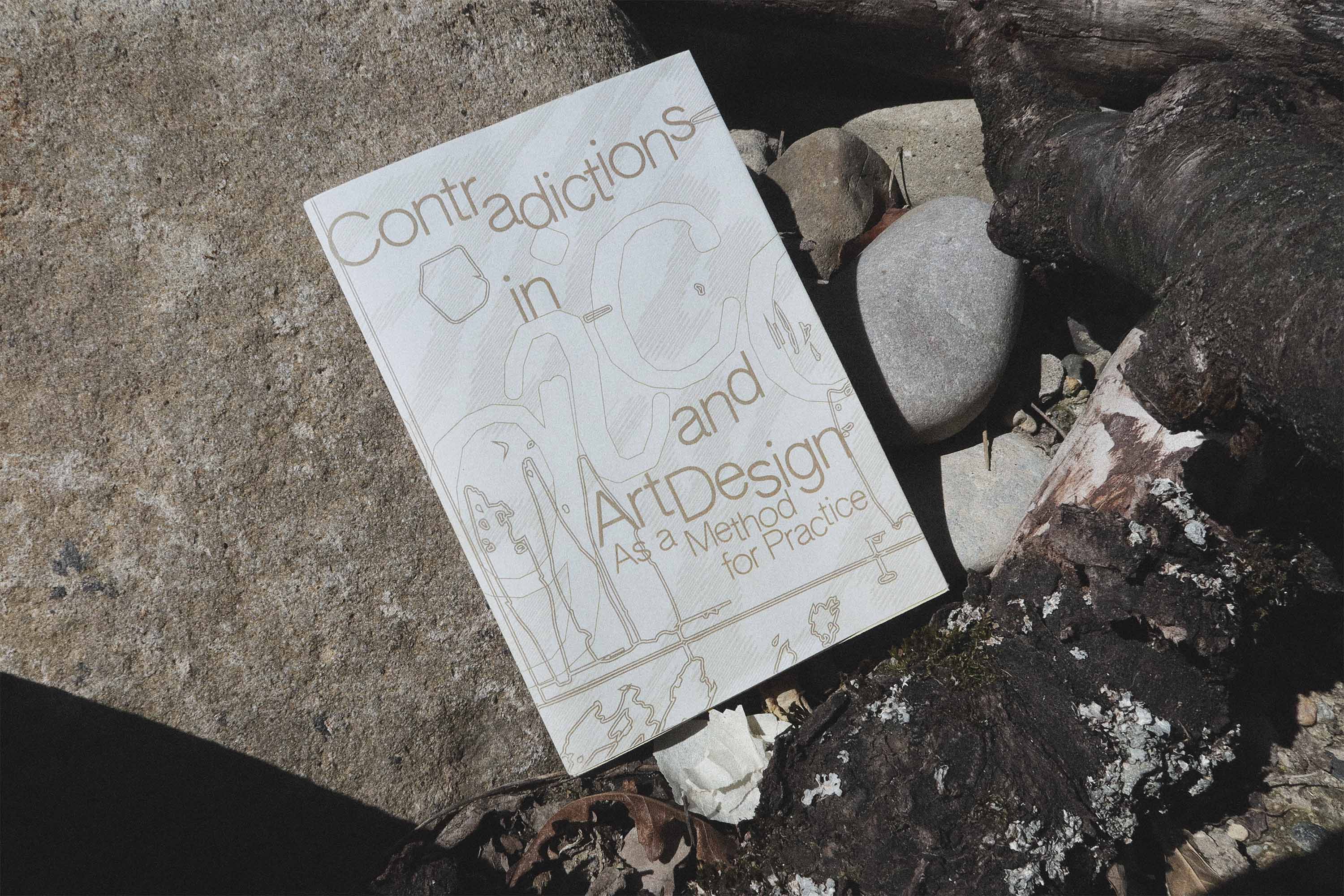
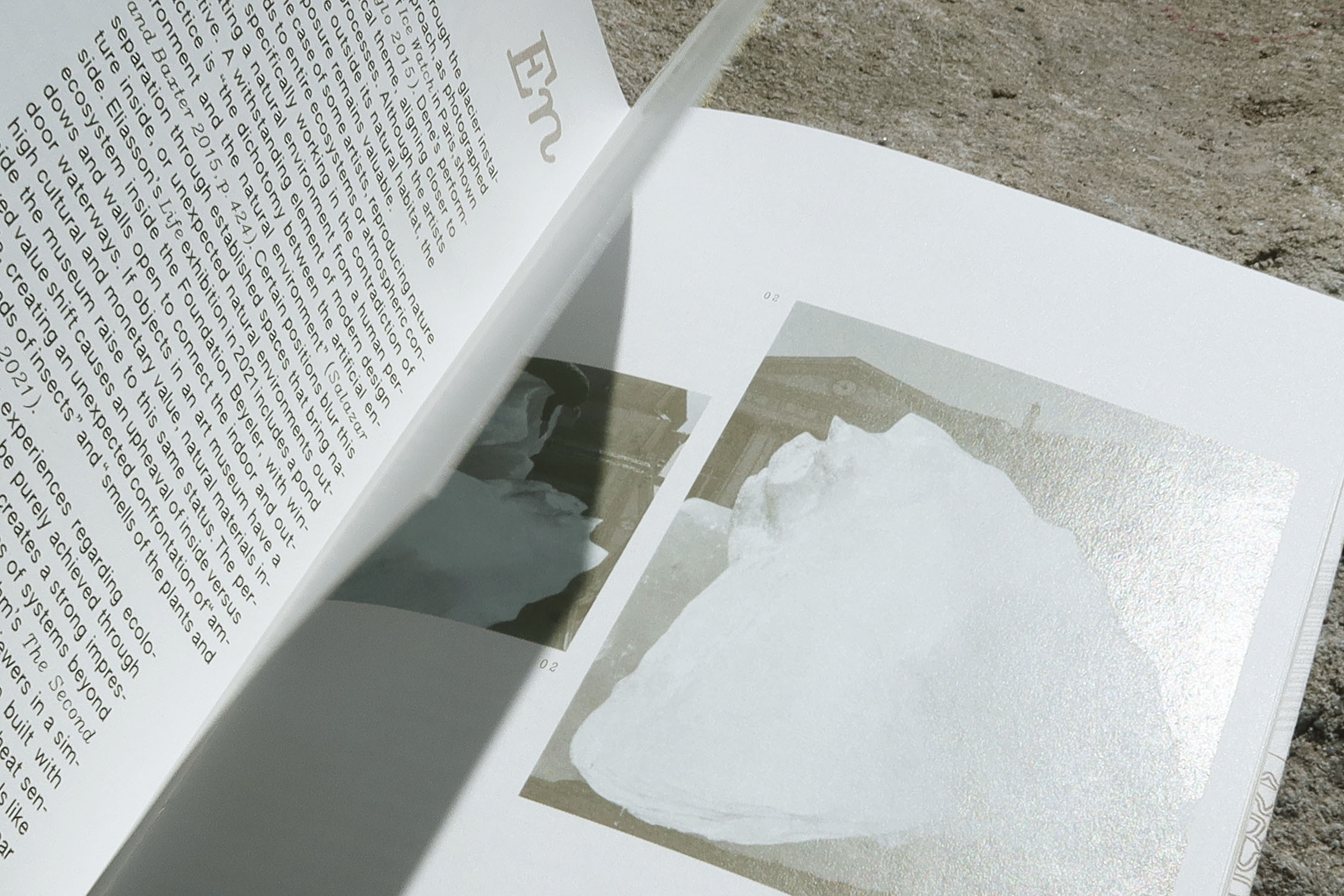
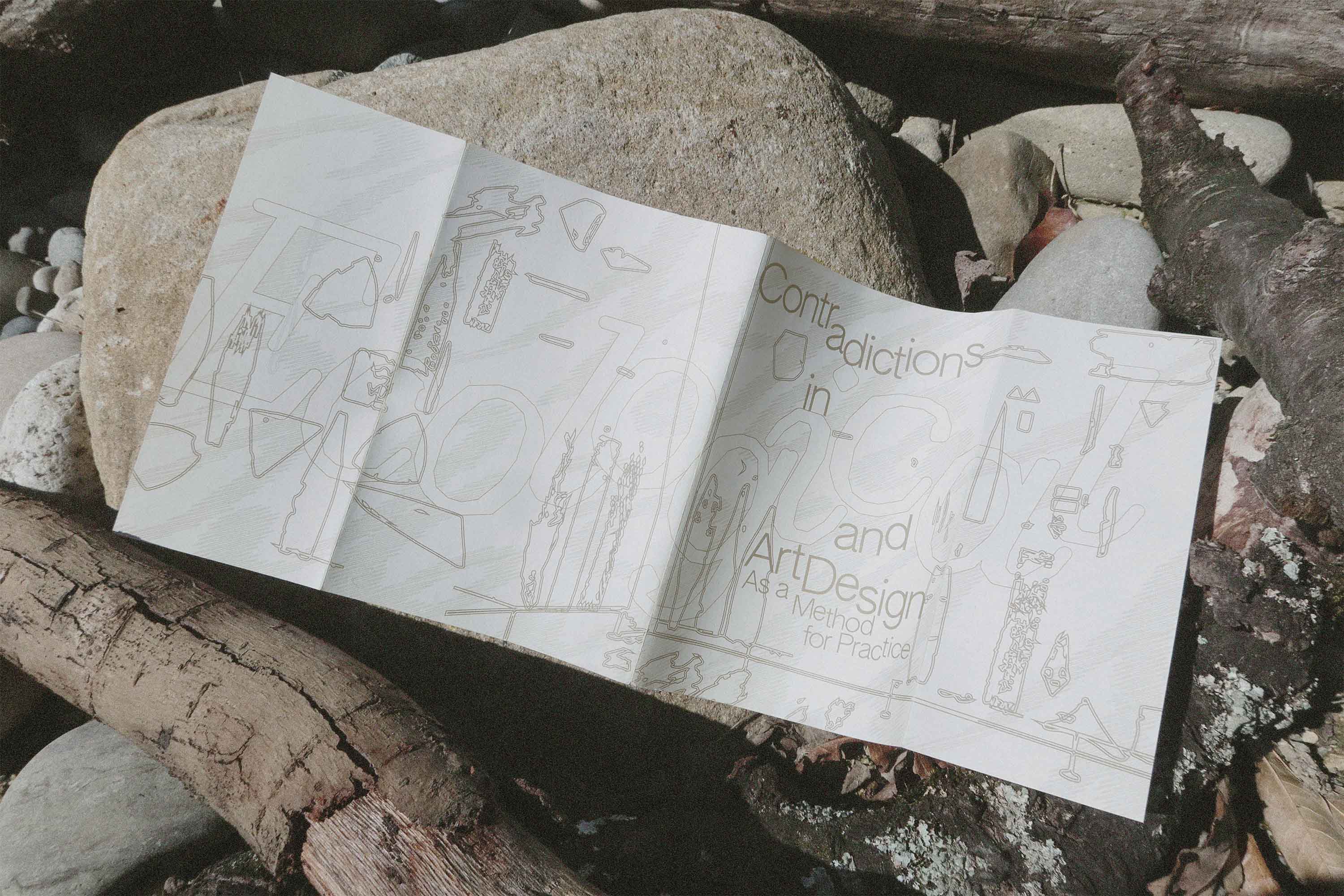
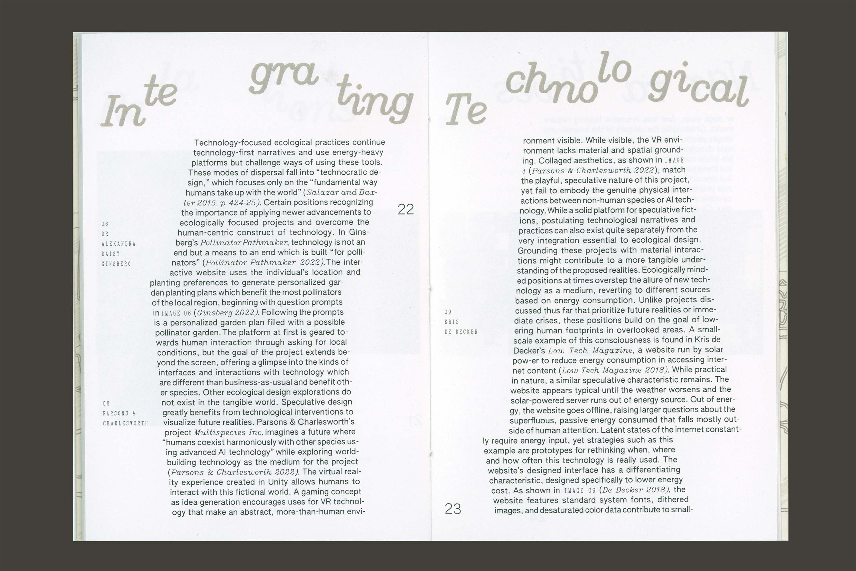
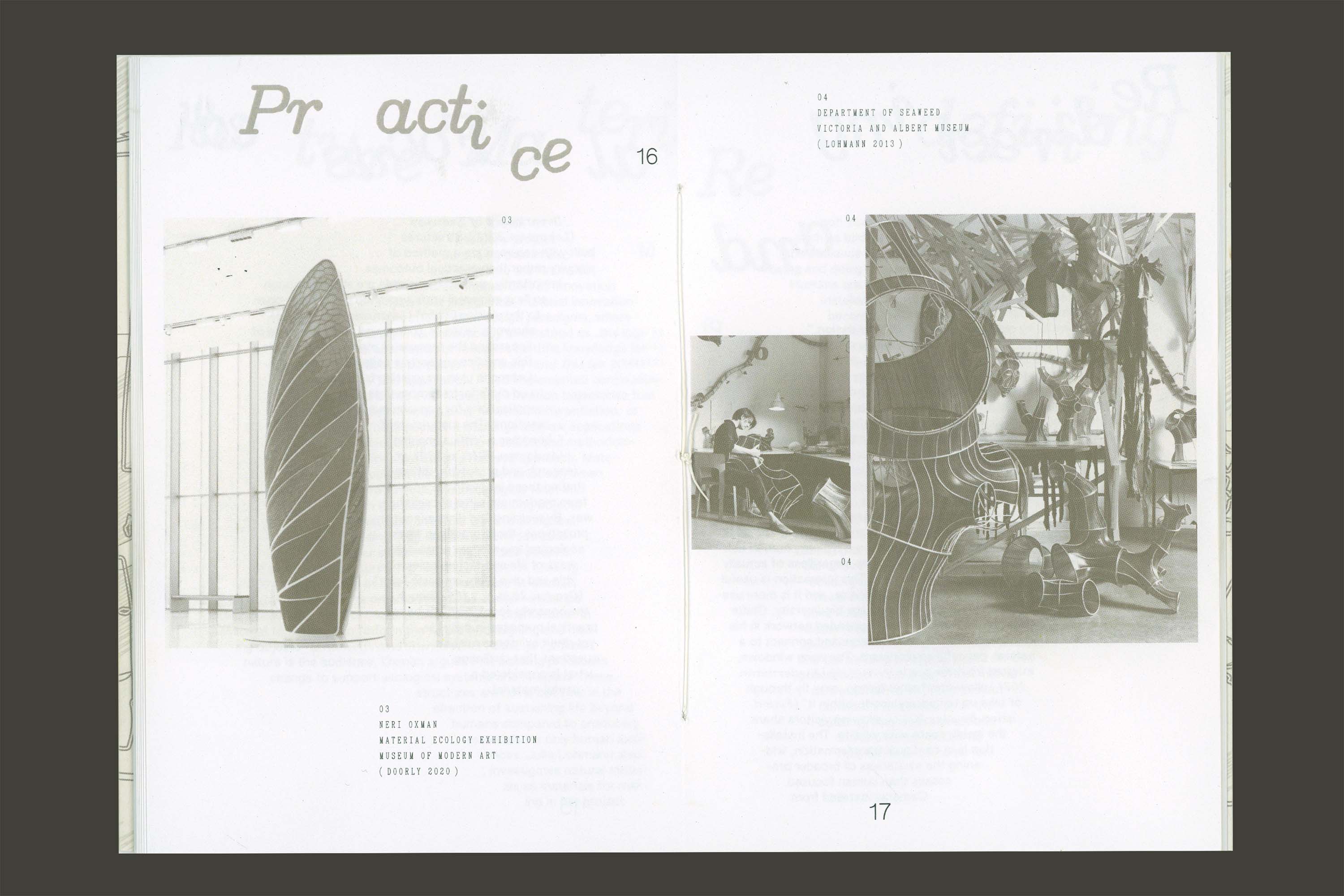
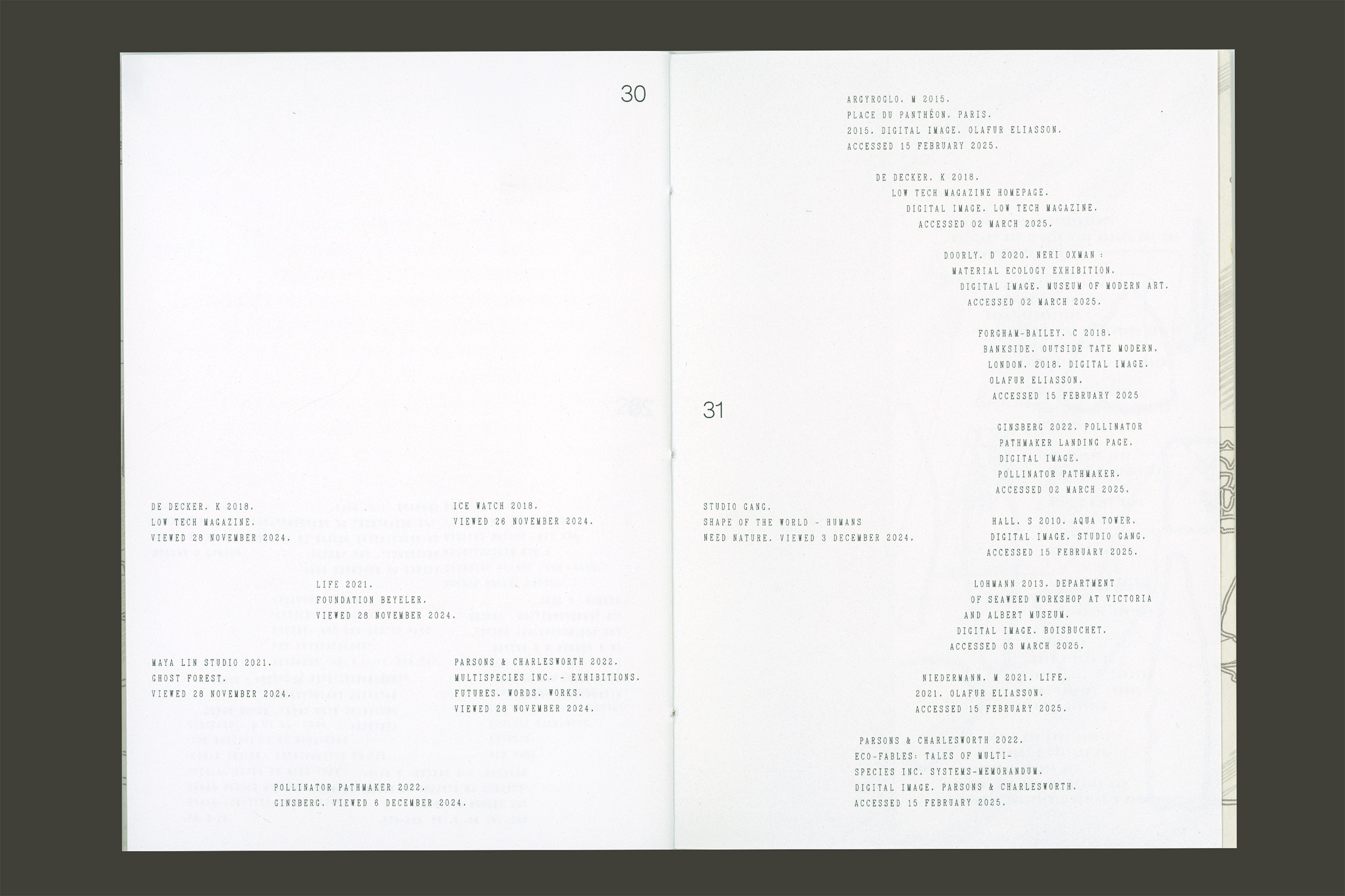
The publication includes a self-published essay that discusses contradictions in ecological design as a method for practice. Specific visual interventions explore key concepts from the text. The sections co-exist by each maintaining an own formal typesetting logic. The result is a reconstructed version of the text. Text is used as image and often adopts the form of the referenced works. Relations are redefined through a variable page number position. Contradictions are explored through the use of Authentic Sans, an open-source typeface designed specifcially to contradict standard rules of a sans-serif geometric typeface. Hershey Noailles Times visually mirrors Julia Lohmann’s seaweed sculptures and echos the materiality in the discussed works.
Ecological Method for Practice
Editorial / Essay
1/7
2025